


Do you sell SaaS?
I suspect you relentlessly challenge your instincts about how to present content on your homepage.
I’m with you. I’m a soldier in the SaaS wars. Helping create SaaS websites and building stronger digital marketing arsenals to back them up is my “wheelhouse.”
It’s hard to say what’s the ideal way to stack-up the content on your homepage. In an effort to help you consider the best options and make smart calls, I’m going to share with you content, copy and design ideas to plan the next iteration of your homepage.
A hero shot goes first
Your SaaS homepage begins with a hero shot (or header). Companies make a variety of choices here, but I submit sliders and carousels are out. They’re not yet extinct, but they are old school.
This is the scrolling age. It’s naïve to think a visitor will wait patiently as your slide show plays. You’ll be far better off to identify your most important message and get to it.
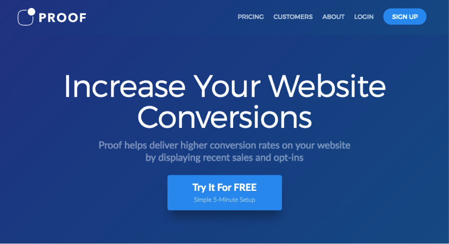
I love what Proof does. No motion. No stock photography—such as the predictably deadly desktop with a neatly arranged computer, plant, coffee cup and notepad. No screenshot. No innocuous wallpaper or shenanigans of any kind.
They hit you fast with the benefit of using their product, in four words. A tidy subtitle drills down into the who, what, and how. The call-to-action isn’t a selection and it doesn’t diddle around. It says “Try it for free.” And if you should fear doing so might be complex, Proof assures you it’s a simple 5-minute setup.
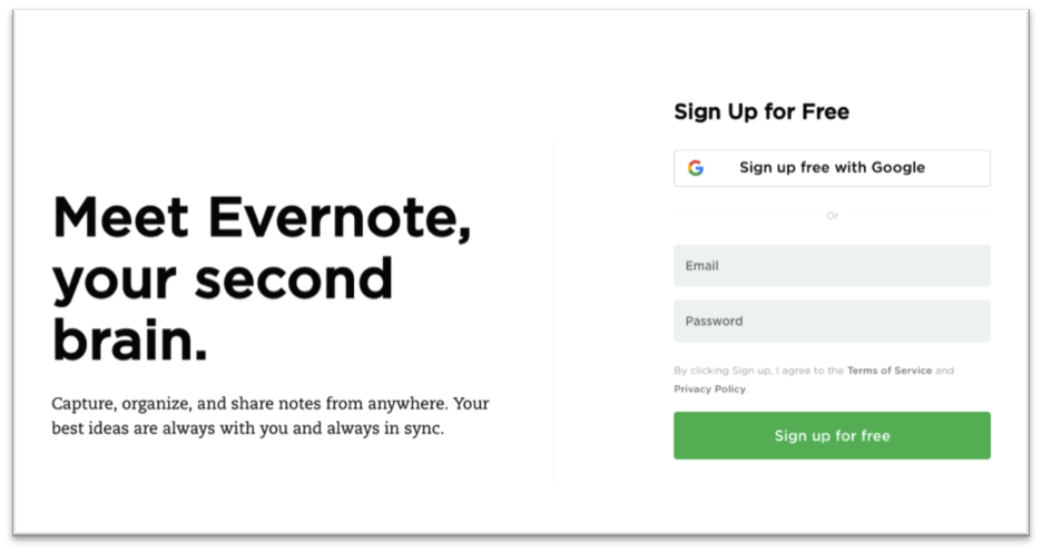
Welcome to the top of the Evernote homepage. There’s actually is a bit of animation here. The headline rotates. But it does so quickly and is impossible to ignore. The sequence reads…
- Remember everything.
- Get organized.
- Succeed together.
- Meet Evernote, your second brain.
I love that. And… bam… Signup form, with two choices: sign up with Google or enter an email and password. Everything about the homepage is clear, simple and deliberately unfussy. A great lesson in minimalism. A+ for its homepage copy.
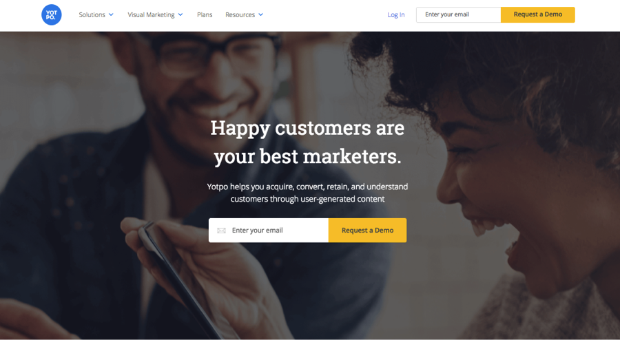
Atop its homepage, Yotpo delivers another lesson in smart content, copy and design.
Let’s start with the design approach Yotpo uses in its current hero shot (keep in mind SaaS companies test and change their approach often). Sure it’s probably a stock photo, but it’s no groaner. In fact, it emotes in a big way.
It also earns big bonus points for its composition. Note how both characters’ eyes provide you an eye path to the headlines and call-to-action. Again, a nice slice of headline writing, subtitling, and no-nonsense call-to-action.
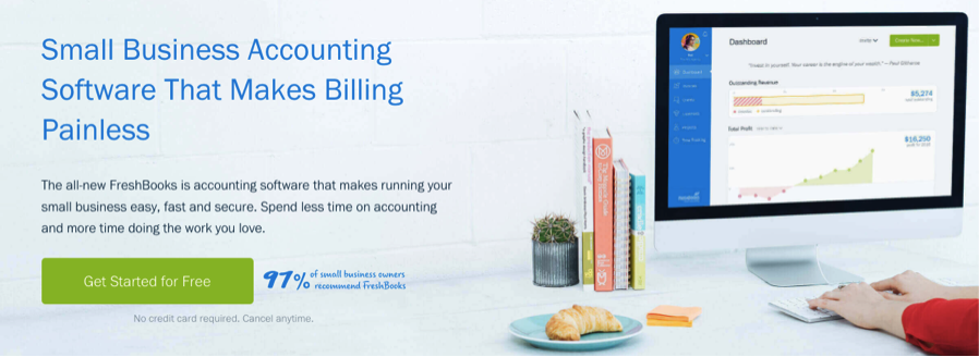
For the first time here, with the Freshbooks hero shot, we see the ol’ desktop (where’s the coffee?). And, as is often the case with SaaS companies, you’re also shown a screen shot. Yeah, so far it’s a yawner. But still, I find it effective.
All that kind of mundane nothingness steers me to the copy, which is good stuff. It answers my questions immediately and the use of the word “painless” nicely introduces an emotion I can relate to. Accounting is painful.
We’ll get into social proof in examples to come, but note the inclusion of “97% of small business owners recommend FreshBooks.” Well done.
Notice too, the bing-bang passages beneath the button. “No credit card required. Cancel anytime.” This call-to-action scores big bonus points for overcoming potential objections and making a trial nearly irrestible.
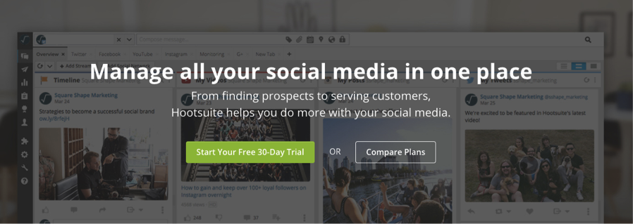
Hootsuite probably doesn’t have the tidiest design here. I don’t love the “screenshot as wallpaper” approach. It’s busy.
However the copy here is simple and smart. The call-to-action isn’t singular, but I applaud how it aims beyond handing out the freebie. A second option says “Compare Plans.” I feel their confidence.
This one, by Dasheroo (which I wrote), manages to pull off some of the tricks Hootsuite is going for, but with a cleaner design. My eyes actually take in the software’s interface here.
The headline and subhead tell a meaningful story quickly. I forgive the cliché desktop shot (which once again fails to include a coffee cup).
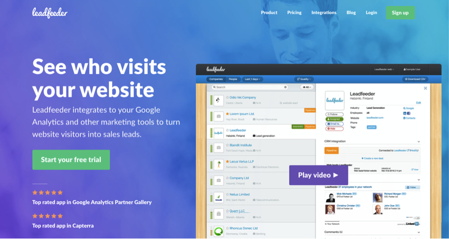
Bravo Leadfeeder. First, I applaud the headline. It’s gold. A great homepage headline answers the question, “What will this service do for me?”
Note the 5-star ratings, which I’ve featured for the first time in this post. Smart.
The design, while it has a lot going on, it balances nicely and actually compels me to take in the software’s interface for a second.
And the purple button? Play video. I believe that is a cool option—much cooler (and kinder) than having it play automatically.
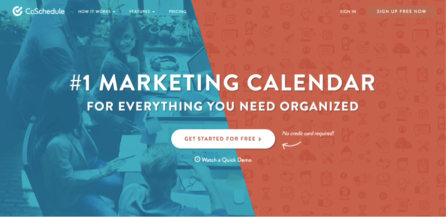
What I like about the CoShedule hero shot is its effective layout and the nice touches the call-to-action (CTA) includes. “Watch Video” is an option, but far from force-fed and if I’m wavering on getting started for free, they make it clear I need not give them my credit card (or post a reminder to myself when my trial expires).
Yeah, we’ve spent a lot of time on the hero shot or header.
It’s warranted. It’s what your visitors see first. And if it doesn’t satisfy their curiosity, it’s all they see.
The headline is ALL-IMPORTANT. Don’t let a designer tell you otherwise. It’s not the image that matters most. It’s the headline. None of the images I’ve shown you are remarkable.
The good ones simply support the message or get out of its way.
But there’s a lot more to a SaaS website homepage than a hero shot. So a-scrolling we shall go.
Something important is next
There’s no prescription for the type of content that should follow your hero shot. In fact, nearly every element we’ll explore in the rest of this post could go in any order.
A technique I like and see often is to present some combination of images (often screens) that speak to the how. The sequence makes sense:
- The homepage’s first headline delivers a “why” proposition (benefit).
- The supporting subtitle or copy that follows introduces the “what” (product).
- The next row on the page begins to answer questions like, “Here’s how you do it,” or, “Here’s how it works” (features).
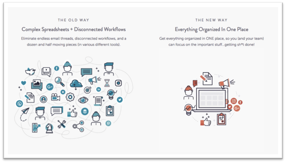
Remember, from above, CoSchedule explained you’ll get organized with their marketing calendar. The row that follows hits on the time-tested problem/solution communication strategy: The old way vs. the new way. Good stuff. Bonus points for some nifty animation, which is attention-getting, but not a distraction.
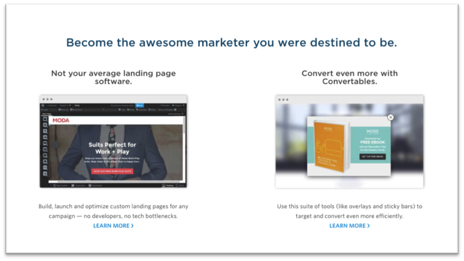
I love the inspiring headline here atop row two on the Unbounce homepage. What follows neatly breaks down the company’s two main products.
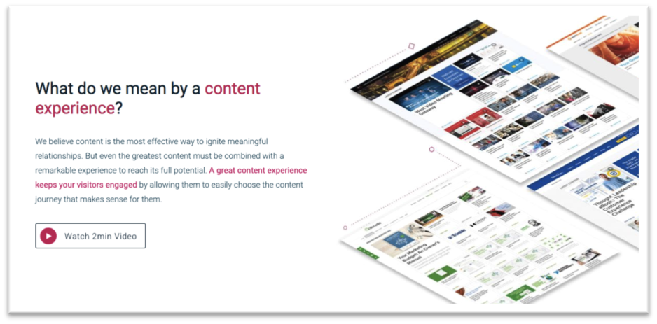
The second row on the Uberflip homepage encourage prospects to watch a 2-minute video to learn how to create a great content experience. I think that’s smart placement.
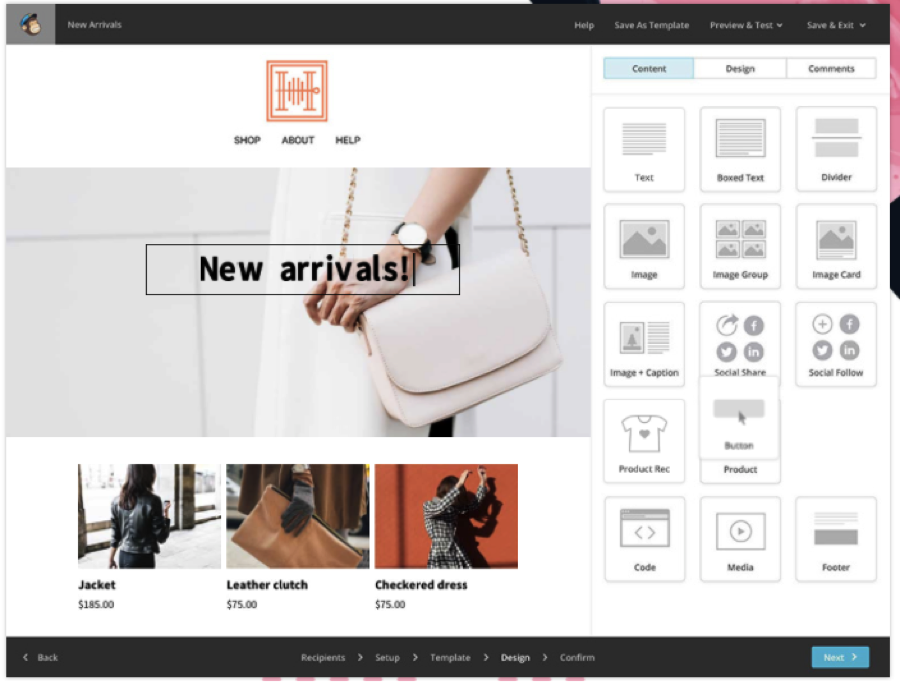
This static image doesn’t do justice to the “how it works” feature MailChimp presents on its homepage all that well because animation is what makes it persuasive. Squint a bit and notice the cursor in the image above. This cool section is a mini, high-speed demo of the product’s drag-and-drop functionality.
Drilling deeper into features and benefits
Most SaaS companies assume prospects want to at least an overview of the main features and benefits sooner rather than later, as in, on the homepage. And the assumption is the viewer will scroll a bit to read them.
I should probably say, “skim” rather than “read.” In the examples that follow, you’ll find very deliberate attempts to make the feature showcases a quick read with:
- Short subheads
- Short passages
- Massive white space
- Effective eye paths
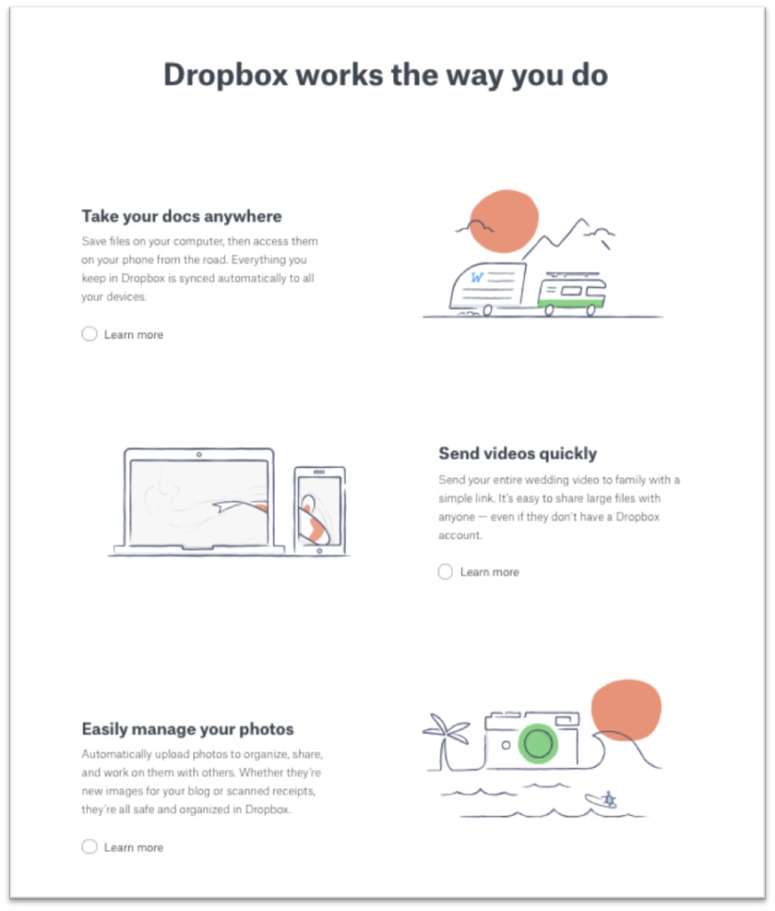
This element from Dropbox Business (a company that’s always mastered minimalism) does what I call the “ping pong” presentation. The copy and images alternate sides. Dropbox introduces a little twist by using illustrations.
Of course, the ping-pong presentation you see more often features photographs. Apple has done this to great effect for decades.
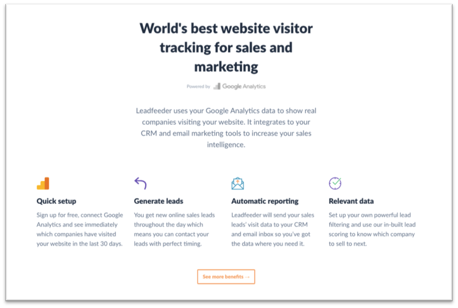
We’re looking at Leadfeeder again here to showcase the other popular way SaaS websites present features and benefits: the grid. Several nice touches make this one a winner including the funnel-shaped eye path created by the copy and the use of simple, elegant icons.
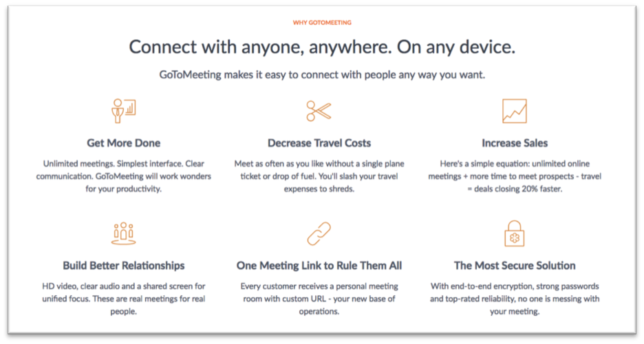
GoToMeeting nails the features and benefit grid in a similar way and neatly stacks six important points in two rows, with icons, and copy centered underneath.
How “who” enters the picture
Common challenge: your SaaS offering has multiple sweet spots. It serves a variety of different customer types, most likely categorized by job function or industry. Some companies call these “use cases.”
You might take a cue from how some of these great SaaS marketers handle the “who.”
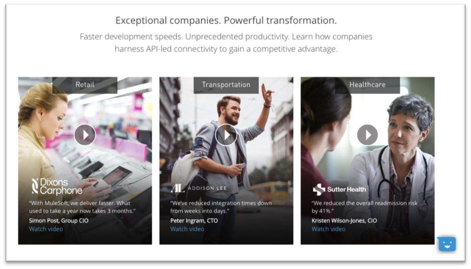
MuleSoft neatly lines up three short videos for its three target markets. I love how the video thumbnails preview the most key information. It makes it so the homepage element is valuable even if you don’t watch a video.
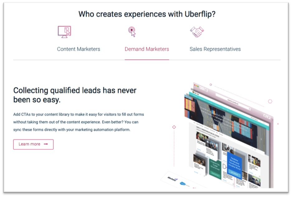
One way companies tackle their “who we serve” section is by creating a mini-carousel, which might be invoked with a mouse-over, click, or simply play automatically. Here, Uberflip has essentially created a tabbed system.
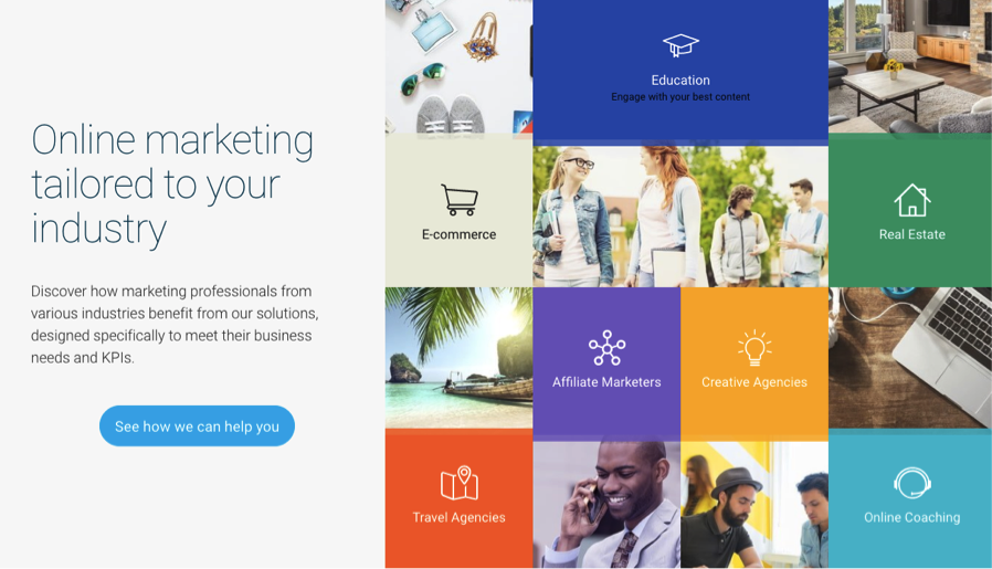
GetResponse totally nails the “various industries” element of their homepage with a gorgeous design that’s easy to navigate. Clicking the button in the left column takes you to an expanded version featuring 15 verticals.
I don’t believe I’ve ever seen a SaaS homepage that didn’t offer some form of social proof. The approach is so universally embraced now—and expected—it’s like making a homepage without some form of social proof risks saying to your viewer, “No one likes our product.”
Social proof comes in many forms. Here’s how SaaSters demonstrate they have happy, satisfied, and sometimes prominent, customers—and display other trust signals.
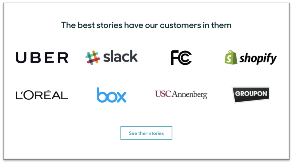
ZenDesk presents a logo-rama of customers, as most companies do, but offers each as a link to a custom success story. Great headline here.
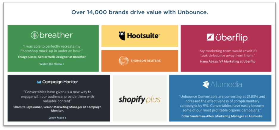
Unbounce kicks off their logo-rama with an impressive customer count. I like how this design combines logos and testimonials.
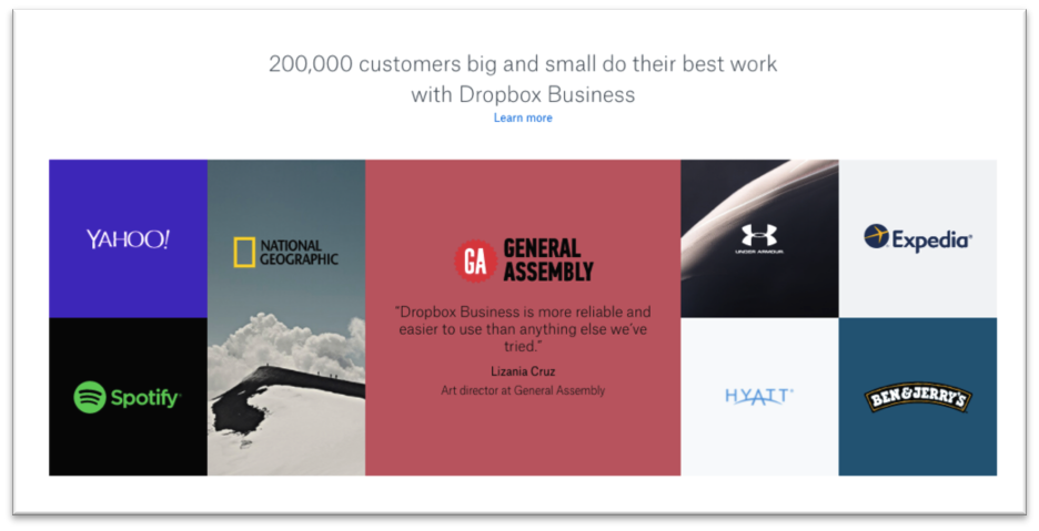
Dropbox Business goes for a similar thing with a touch of photography and a little minimalism. Not that Dropbox lacks for customers, but the single testimonial is a nice touch and smart idea for companies just starting to collect testimonials (or clients).
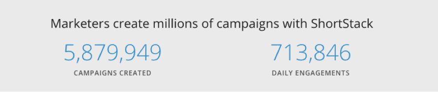
ShortStack has a lengthy homepage and takes an interesting approach. Rather than creating a singular social proof section, they inject various proof points in several spots. The counters—campaigns created and daily engagements—make a powerful statement…
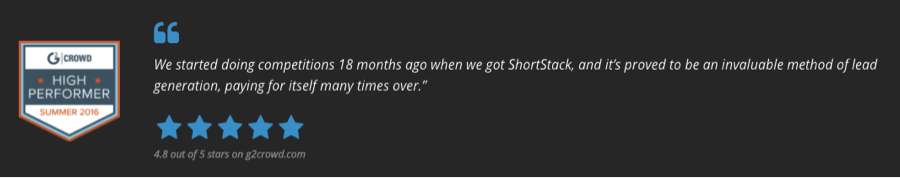
… And the proof keeps coming. ShortStack showcases a highly respected badge from G2Crowd, testimonials, and a stellar average ratings grade.
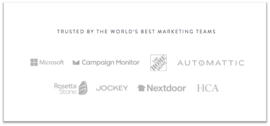
I show you CoSchedule’s logo-rama because I think it’s really smart how they’ve positioned their clients as “the world’s best marketing teams.” Those guys can write.
It kills me when testimonials are anonymous because they have the opposite effect of building trust. They built suspicion. Give me names, titles, faces. Give me the truth.
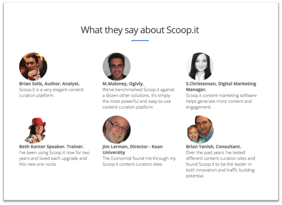
Scoop.it offers the familiar faces and remarks of industry leaders. (Hey! I used to be among them. What gives Scoop.it?)
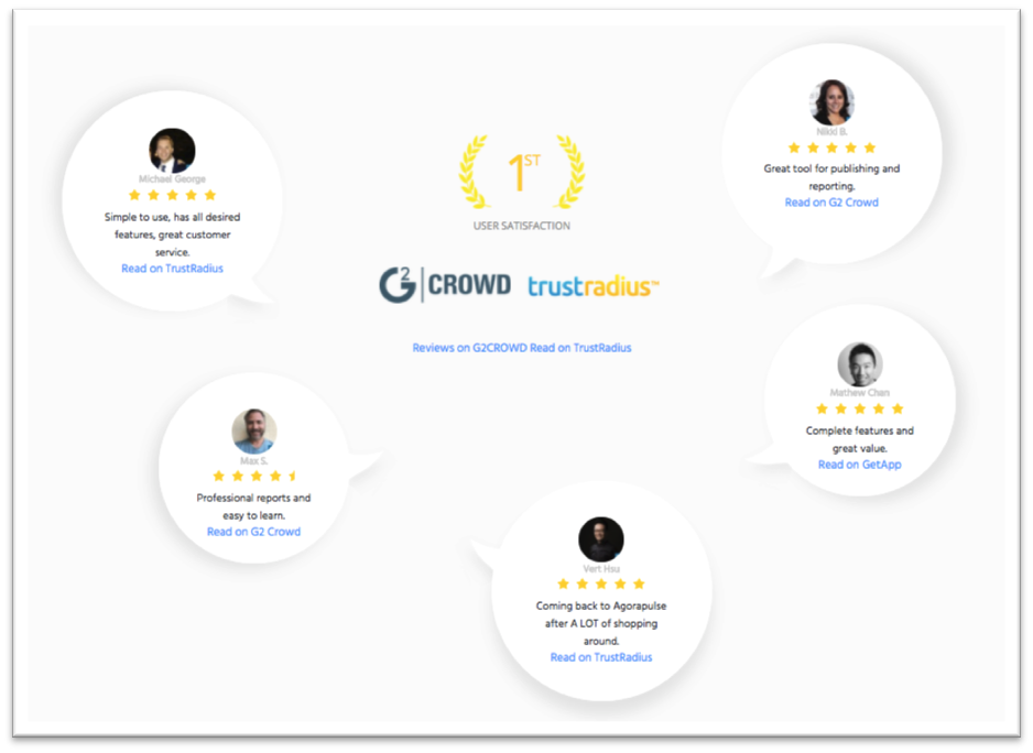
AgoraPulse rolls a smorgasbord of trust signals into one tidy space on its homepage.
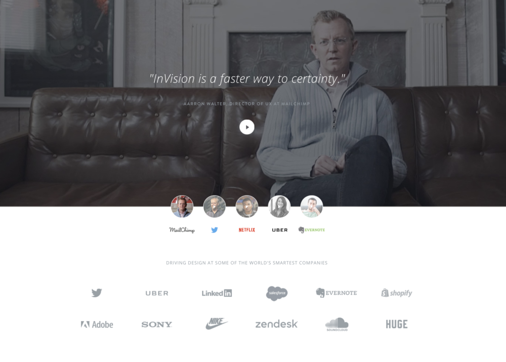
Perhaps this social proof and customer story showcase by Invision is the grand poobah of social proof elements. They’ve rolled much of what we’ve reviewed all into one. I think the customer photo and brief testimonial highlight is golden.
In the media
Whether it’s another form of social proof or the result of some good PR efforts, the homepages of SaaS websites often have an “As seen on” feature to highly media coverage.
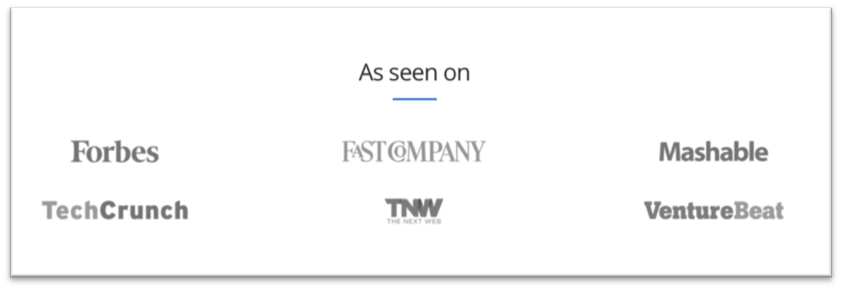
A media logo-roma including publications known for covering SaaS offerings.

Sometimes these are presented in a slider format.
One final note on this… You need not hold out on this tactic just because your company hasn’t been featured by a big name media outlet. Consider showcasing media of the web variety such as podcasts you’ve been on or events you’ve had a role in.
Getting started
Marketers need to overcome objections. It’s one of the most important, and often overlooked, strategies for a homepage—or any “selling space.”
In many cases, prospective customers are going to like what they see on your homepage, be somewhat convinced your product will be useful, and bail anyway. Why? That’s for you to figure out… price, hassle, learning curve, commitment, or some fear of some kind.
Being that the products are so often free to try in the SaaS business, in my mind the biggest objection swimming around the mind of the prospect is likely to be:
This is going to be difficult.
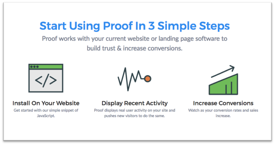
On the Proof homepage they skillfully tackle the fear of getting started. They explain it takes 3 simple steps (actually 2 if you read the copy).
Showcase the goods
A wide variety of SaaS products are going to lend themselves nicely to a portfolio. While there are many ways to present a portfolio and you should brainstorm how to best showcase your wares, essentially you’ll demonstrate:
- What you can do with the product, or
- What others have done
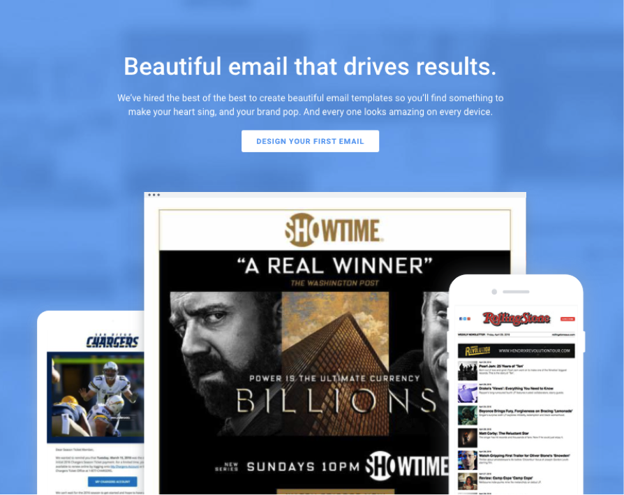
Email and marketing automation provider Campaign Monitor showcases “beautiful email that drives results.” This section of the page animates such that the examples presented on the browser and smartphones quickly rotate.
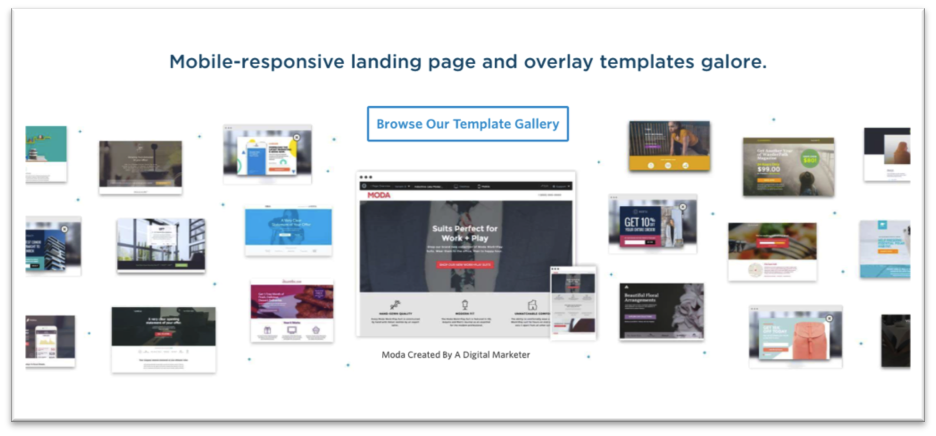
An all-important component of the Unbounce trickbag is its robust library of templates for getting started. Based on the design and headline, it’s clear what they want you take away from a quick glance is they offer a lot of templates.
Integration indications
Will your stuff work with my stuff?
This is a huge question in the SaaS space and relevant to so many companies. As the marketing technology sector continues its explosive expansion and growth, specialized applications proliferate. Integration (or integrationability) is bound to be a question your customers have.
Answer it.
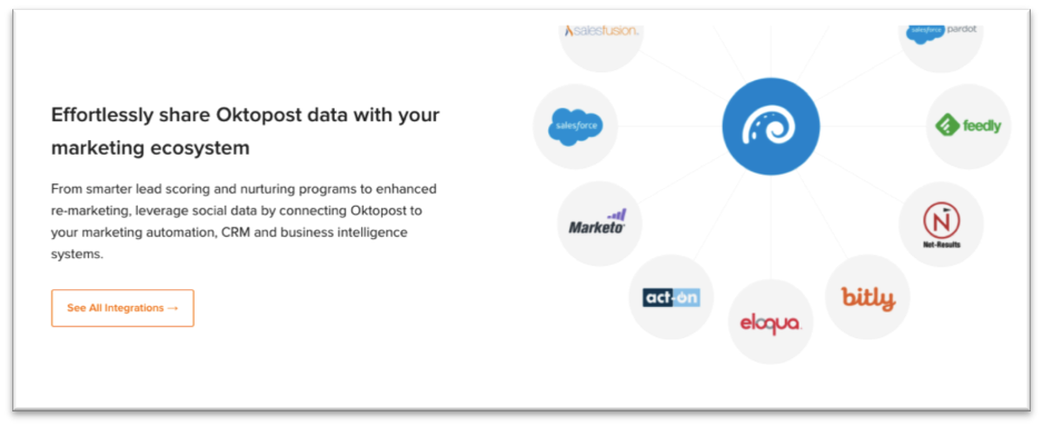
Most SaaS companies that need to address if and how their service plays nice with others, do so. Oktopost does so nicely on their homepage with a logo-rama, which is similar to how most SaaS companies handle this challenge.
To content or not to content?
Like most companies, SaaS companies are eager to practice content marketing. In fact, from what I’ve seen, many do it at the highest conceivable level. Some of the companies featured here consistently create amazing content, promote it well, and do a good job converting readers/viewers to leads.
But interestingly, very few actually feature their blog, content hub, or even ebooks, on their homepage. What’s more, you seldom see “blog” offered in the menu. Based on conversations I’ve had with executives at SaaS companies, I’ve gathered many believe it distracts from the main goal.
Assuming you have a blog, vlog, or offer some form of content, you’ll have to experiment with where you offer it.
![]()
Once again, here’s a slice of CoSchedule’s homepage. Their blog is consistently amazing, yet you won’t find an invitation to read it in their menu. It can be found in the footer.
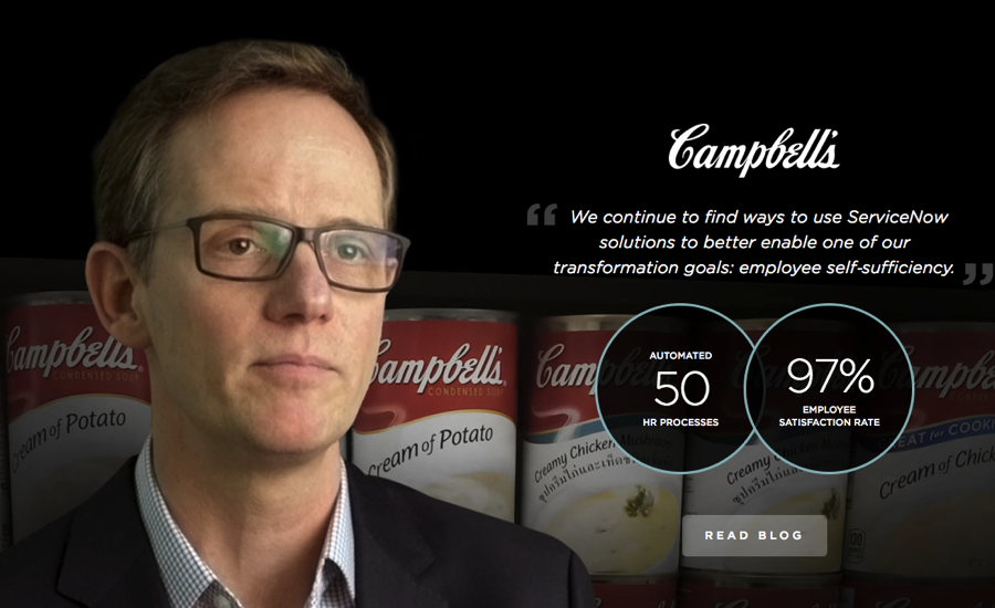
I found this element on the ServiceNow homepage. It’s a cool combination of customer story, social proof and blog promotion. Interesting invitation to a blog, I think.
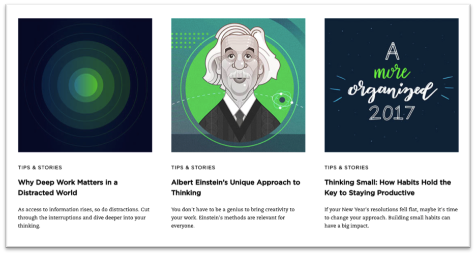
Evernote bravely goes with the straight and narrow approach: this is our blog; read these stories. I like how on-brand it is. I also like how it’s dubbed “tips and stories.”
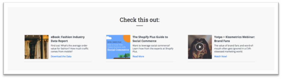
Yotpo offers content on their homepage too—and not just a blog. Read closely and you’ll see this trio includes an ebook, guide, and video.
They’re near the bottom of the page and don’t steal thunder from the offers at the top or the bottom of the page. In my opinion, it works great. I can’t award Yotpo any awards for design here, but I suppose this is their way of including content without sabotaging their product offers.

The Teachable homepage doesn’t shy away from offering content in the form of a webinar. The shot above shows a popup that appears just seconds after arrival. It works. Webinars (or what they dub “free live workshops”) is a big part of the conversion equation for Teachable.
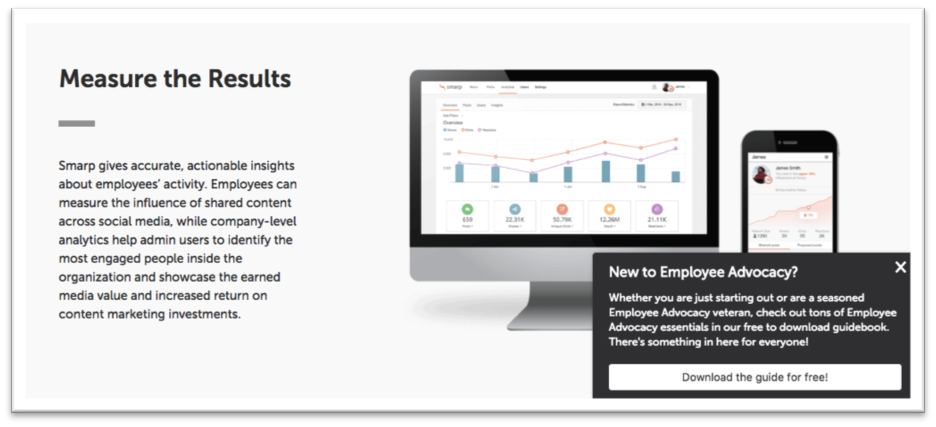
Smart play here, from Smarp. The blog’s not offered in the menu or in a row on the homepage. But as you scroll, this slider form comes forth to offer their free guide to employee advocacy.
Some SaaS sites push customer support
Here’s an interesting tightrope. As a SaaS marketer do you promote the idea that you offer customer support? Does doing so suggest the product is tricky to use? Or does doing so suggest you recognize the second “S” in “SaaS” stands for “service” and your commitment to providing it includes support.
Again, you’ll need to answer that question. My opinion: I tend to have questions about every service I use and value the providers who rock customer support.
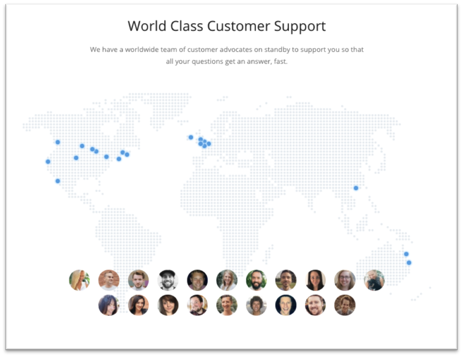
Here’s a cool slice of the Buffer homepage assuring that they not only offer customer support, but their team of “customer advocates” are on standby in various time zones and ready to answer questions.
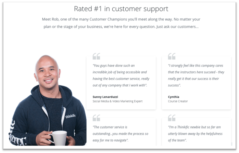
Thinkific clearly understands their customers want answers to their questions and focuses a row on their home page explicitly to showcasing their customer support ratings. I like their approach, but yeah, the generic attributions make me wonder a bit.
Try it, buy it, do something
We arrive now at the bottom of the page, although a call-to-action can appear anywhere or in multiple places on your SaaS homepage.
They tend to have commonalities:
- Simplicity
- Buttons
- Action-oriented headlines and/or action-oriented buttons
However, as you’ll see, the call-to-action is handled in various ways, providing evidence there is no perfect way. Let’s look at some good ones.

I love this one from ZenDesk. It’s not a marriage proposal. It’s like it asks for a date.
Remember, atop their page, Yotpo proclaimed “Happy customers are your best marketers.” In their CTA, Yotpo put a beautiful bookend on their story positioning their product in a very powerful way.

Nothing fancy here from Cyfe, but a killer call-to-action that reintroduces the problem they solve.

Freshbooks performs a series of effective ideas in their CTA outside of the headline and button by overcoming potential objections and reiterating one last piece of social proof.
Should your prices go on your SaaS homepage? The strategy makes sense to me. No one buys anything without asking what it costs. However, SaaS providers almost always have various pricing tiers. AgoraPulse wisely splits the difference by presenting the most affordable option (and free trial—and pricing page).
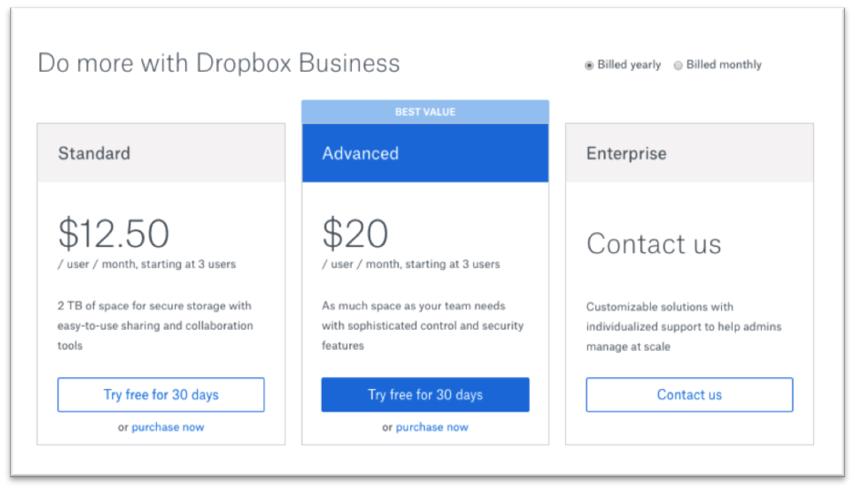
Dropbox Business just gets right to it. Here are our price tiers. As many software companies to, they “sell to the middle” by presenting a “Best Value” option in between lower an higher-priced plans.
Don’t leave empty handed
Your call-to-action (or even your footer) isn’t necessarily your last crack at conversion. The exit intent pop-up offer has become a hot trend.
Though many marketers still squeeze their noses when the idea of pop-ups pop-up, I believe putting one in place is smart marketing and know it’s an email list building tactic.
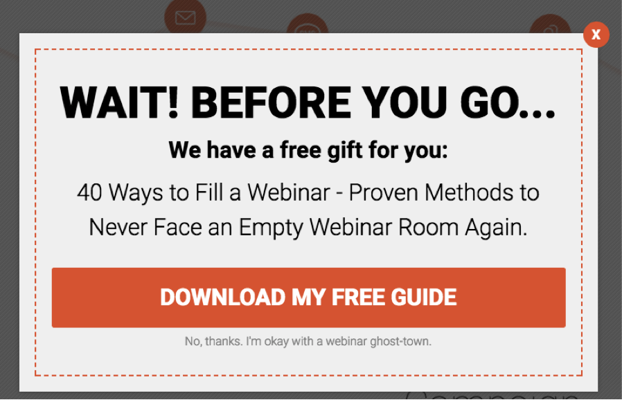
WebinarJam believes it’s wise to offer prospects a free gift as they make their way out without converting. Look at how attractive the “yes” response is and how silly the “no” response sounds. It may be a tad manipulative, but pop-ups work this way so often, there’s probably something to it.
I’d write and design this pop-up much differently. First, I’d show the free guide in an effort to make it more tangible and attractive. Second, I’d lose the “WAIT” headline and replace it with a value proposition.
What going on your SaaS website’s homepage?
We’ve covered 13 types of elements that might go on your homepage. The list’s probably not complete, but I’m hoping it helps you deliberate on the pros and cons of each and gets you started thinking about prioritization.
Want help with your SaaS website? Hit me up.
")


Comments
Stefan Debois
These are all great components for a SaaS homepage – but the point is that you have too choose exactly which ones to include otherwise your page becomes way too long – curious to know what you think about our homepage? https://surveyanyplace.com/
Barry Feldman
Stefan, Thanks for the comments. Checked out your website. Looks solid.
Stefan Debois
Thanks 😉
Tony
I too like your website, content and visual design… it’s clear and mature 🙂