 Want to get a better grasp of effective email marketing strategy? Meet one of the foremost experts in the email business.
Hunter Boyle knows how to make email marketing pay. Senior business development manager at email marketing powerhouse, AWeber, Hunter’s skilled at showing you exactly what does and doesn’t work. He does so fearlessly and with a sense of humor.
I found myself leaning into Hunter’s session at Conversion Conference San Francisco because he made so much sense. Then I asked him to do an interview to help make you a better email marketer.
First, I asked if the two primary purposes of email marketing—lead nurturing and conversion—are they two different things.
“Conversion is any type of event that makes an agreement between two sides,” he said. He cited many examples: visiting a site, downloading something, submitting information, signing up for a free trial or beta, and of course, making a purchase.
“Lead generation, as a process, is a little bit different. The goal is very similar. The goal with lead nurturing is to bring people along from prospect to customer to get the ultimate conversion. However, there can be many conversions along the way throughout lead nurturing—before making an actual payment or a purchase decision,” Hunter said.
Email often fails to wow.
When I asked Hunter to get into why emails fail to engage recipients, he said, “The short version is they just suck for whatever reason. It could be very bland subject lines. It could be uninspiring copy. It could be a design that looks shoddy, or a topic that is way off base.”
“If you have some sense of what your audience wants to read, then you should get it into a format that’s going to engage them. The entire piece needs to stand out in a very crowded inbox. It needs to get enough attention and deliver excitement so it compels action and leads to the next conversion step.”
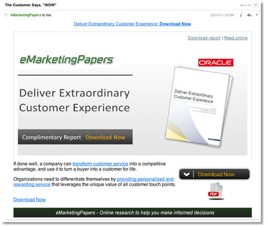
Hunter offered his first example. “Here’s a big company that should be able to hire skilled writers, yet the subject line of their email reads, ‘The customer says WOW.’”
“How could you read that subject line and get excited?” Hunter asked. “There’s a mental disconnect. The word WOW, in caps, attempts to describe a very plain corporate white paper. Nobody says, ‘WOW’ about white papers. When that happens, as readers, we get a negative impression. We’re not only less likely to take action, we’re less likely to open future emails from the company.”
The value proposition that isn’t.
Hunter says email marketers often fail to hit the mark when they don’t effectively communicate the value of the email.
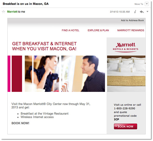
“I got an email from Marriott where the subject line read, ‘Breakfast is on us in Macon, Georgia.’ I was confused. Where’d that come from? I travel a lot, but hadn’t been to Georgia for a long while. The last time I was there, I didn’t stay. I had no idea why Marriott thought breakfast was going to be compelling enough to make me want to go to Macon, Georgia, if I had no reason to be there. It made no sense.”
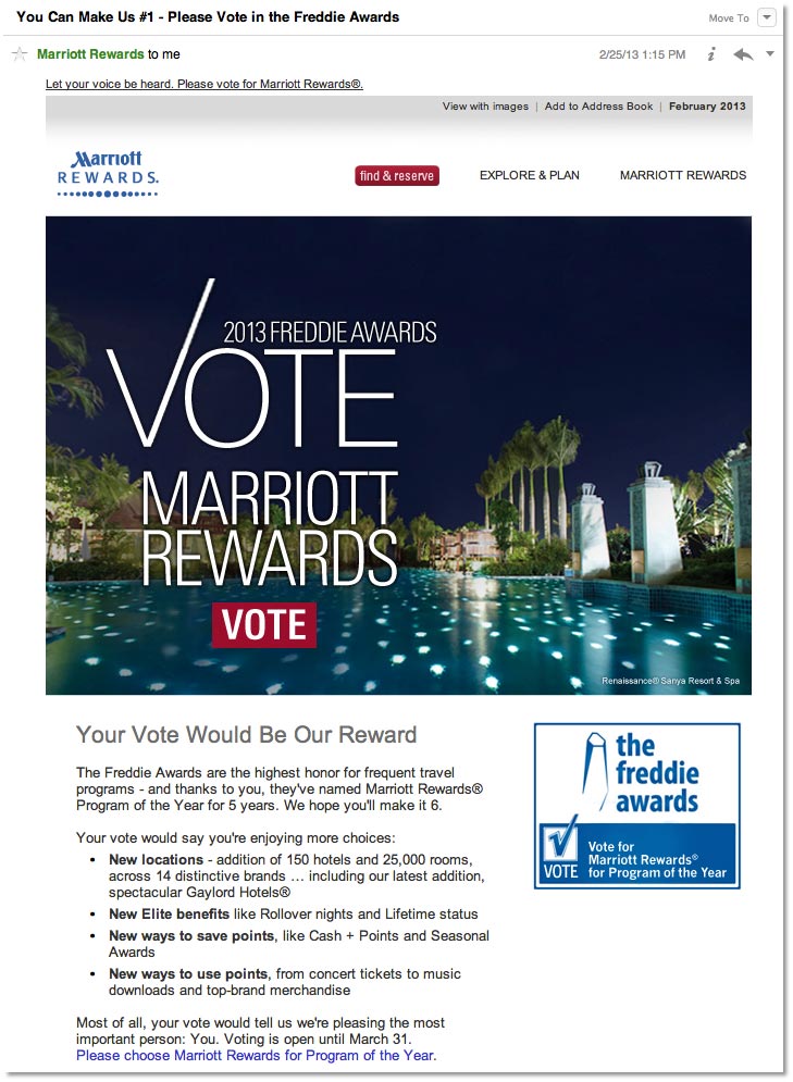
“Probably two weeks later, I got another email from Marriott with the subject line, ‘You can make us number one. Please vote in the Freddie Awards.’ The headline in the email said, ‘Your vote would be our reward.’ I thought that’s really nice, but I’m not sure what you’re asking for. There’s no incentive here for me to do this. Where is it that this request fits inside the lifecycle of the customer of Marriott—even as a rewards member?
“To Marriott’s credit, this past spring, I had an event I registered for at the Marriott, San Francisco. After I registered, but before I checked in, they sent me a very specific message about checking in at the San Francisco Marriott with a mobile app, which would get me through the line quicker. It gave me some valuable information that I could actually use when I was traveling there. That is a whole different ballgame. That’s night and day, in terms of the value an email can provide.”
Emails shouldn’t overwhelm readers.
Visual noise is another email killer.
“Not every email has to be beautifully designed. At the same time, it’s certainly going to help your cause if you don’t have eight different calls to action, especially now, with the way people deal with email on a small screen,” Hunter said.
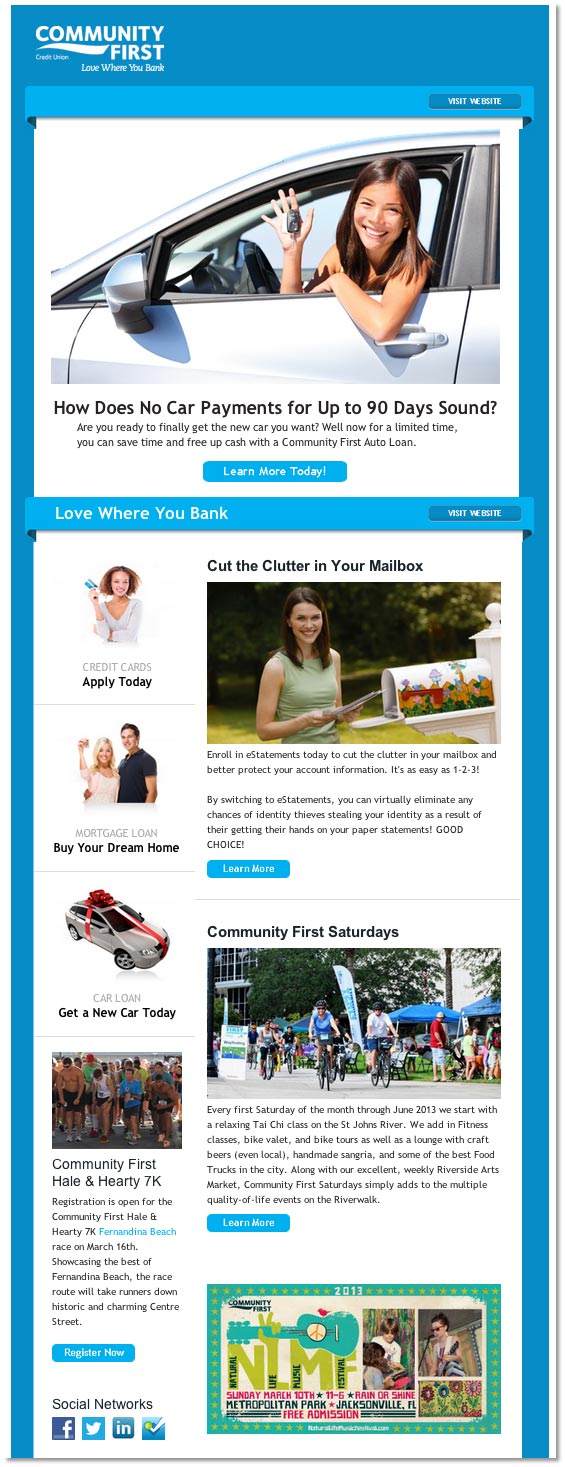
“The example I have is from a bank and it probably has seven call-to-actions.. Another one, a service model, says sign up for this, click to this link, iTunes store, Google ads, etc. There are about four or five different sign-up buttons in each one. There’s big green buttons, illustrations, GIFs, pictures.”
“It pays to simplify. You need to keep it very simple and pared down, so you don’t overwhelm people—not just with the amount of choices, but the design choices you make. You don’t want to confuse readers or lead them into a dead-end. It makes it easier for them to not act, or delete, or ignore your message.”
Too many choices result in no choices.
I mentioned how often I talk to my clients about the danger of having too many choices on a page. However, though most marketers understand the concept that too many choices tend to result in the prospect making no choice, they often forget to apply the idea.
Hunter agreed and then offered a good example of a company who does abide by the “less is more” idea.
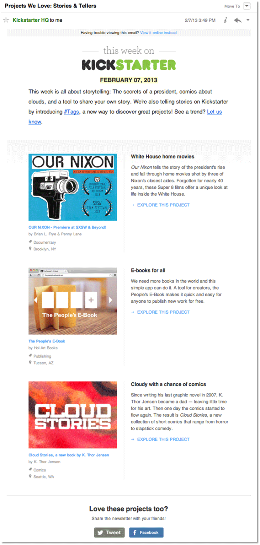
“A lot of people are probably familiar with Kickstarter. They have thousands of projects and things happening all the time, but if you look at their weekly email, they feature three.”
“One big image, one headline, one week to check it out. One, two, three.
They keep it nice and simple. It’s elegant. It’s direct. It’s an email a lot of people probably keep receiving because they know it’s not going to take
five minutes to read through. I know when I get this I’ll be able to skim it. I’ll be able to quickly see if I want to do something or not.”
Emphasize clarity and eye path.
In his presentation, Hunter offered a section about how email conversion often suffers from a lack of “clarity and eye path.” His point is your email needs to be designed to lead your eye to the call to action.
He offered another great example of how email marketers miss this mark.
“Look at this email from Local 11ten, a restaurant. They offered a special tasting event, a five-course chef’s wine and dinner. You get to the bottom and there’s no link. It says, ‘Please call to make reservations.’ It’s tucked down there in plain text looking very much like fine print. The only link in that email is to forward it.”
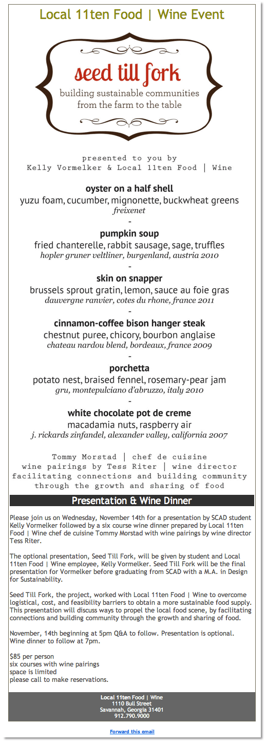
“What’s the thinking on that one as far as the next step? Where’s the link so people can RSVP right from there or purchase their ticket? You need to have
a very clear call to action, make it compelling, obvious, and easy for people to do.”
Then Hunter offered an example of how to do it well.
“This email from Call Loop came with a subject line with WEBINAR in all caps and brackets and then: ‘6,964 new customers by texting?,’ which alludes to the benefits.” He listed the email’s many strong points:
- A very strong headline inside the body of the email says ‘Live webinar workshop. Who else wants more traffic leads and sales?’
- There are a few lines of copy and bullets that are very easy to skim.
- It says, ‘Join us tomorrow, Tuesday, March 5 at 2 PM Eastern.’ It’s very specific.
- A big orange button says, ‘Click here to register. 100 percent content. Nothing will be sold.’
- There’s a link underneath to do it in case your images aren’t loading.
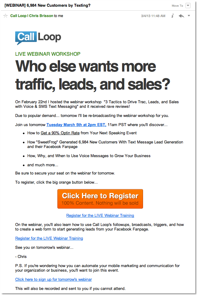
“They did a lot of things right with that email. It was very clear what it was I was supposed to do if interested. If I wanted to sign up for this webinar, there was no doubt about what I was going to get from it, how I could sign up, where, and what to do. Those are the things you want to do to make it clear as possible.”
Hunter continued, “I use this example because I can look at a screenshot of that email from about three feet away. If I pull this up on my iPhone and
hold it out at arm’s length, I can see what the next step is. That level of clarity is what email marketers should strive for.”
What’s in it for me?
The last thing Hunter and I discussed was the WIIFM question, “What’s in it for me?”
“As recipients, the first thing we evaluate is what’s the message, what am I getting out of it, what’s in it for me… why should I care?”
“A lot of emails we send as marketers don’t pass that test. We are trying to promote what we want to promote. We’re not always putting ourselves in the customer’s seat and thinking about what they are going to get out of it, what they are going to see as the benefits.”
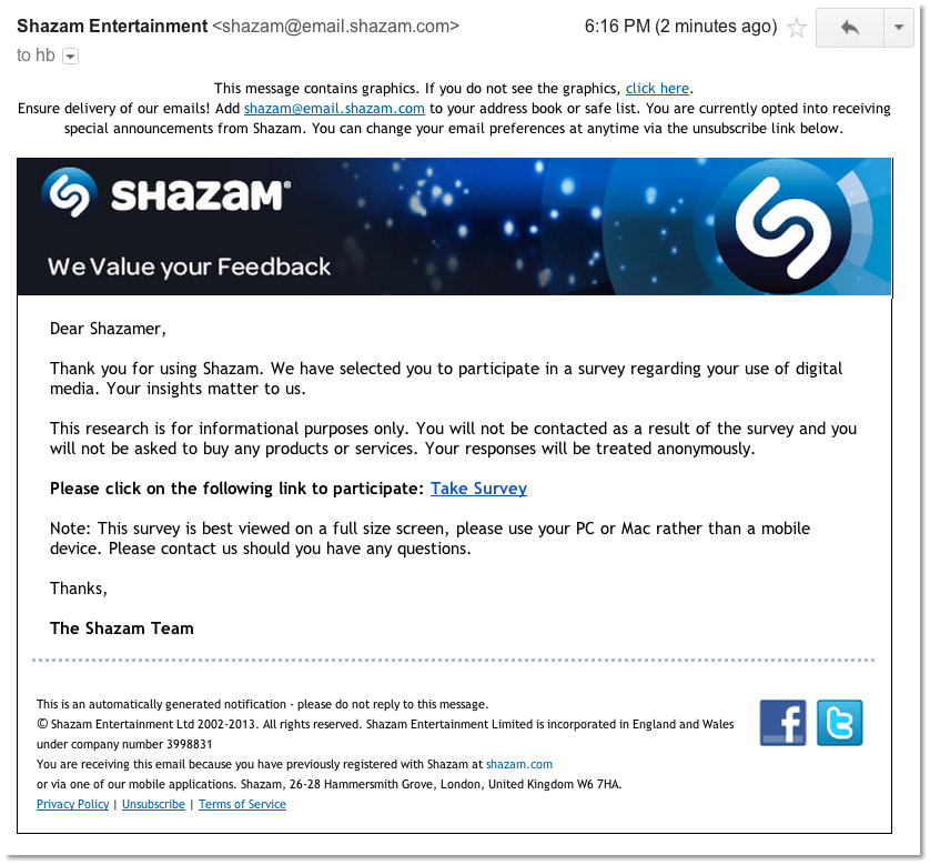
“This email from Shazam says, ‘We value your feedback. Thanks for using us. We’ve selected you to participate in a survey regarding your use of digital media. Your insights matter to us.’ Blah, blah, blah. ‘Please click on the following to participate. Take the survey.’”
“There is no why. You’re asking me for something, but not telling me
it’s actually going to make Shazam better or how it’s going to improve my experience with the app or my life.”
Review your conversion killers.
Hunter summarizes the lesson he gives by suggesting you review five conversion killers and make sure to avoid them with your next email and every one after.
- Engage — Don’t try to create a false set of excitement. Be exciting.
- Value — Align your email messages and offers with the things your recipients actually care about.
- Clarity — Don’t allow your email to be polluted with visual noise and unnecessary options. Keep it simple. Minimize choices. Create an eye path.
- Call to action — Make your call to actions unmistakable.
- WIIFM — Answer the question, “What’s in it for me?”
Here’s an in-depth post covering the ins and outs of nailing effective email marketing.


![How to Create and Use Welcome Emails [Content Jam Episode 34] How to Create and Use Welcome Emails [Content Jam Episode 34]](https://feldmancreative.com/wp-content/uploads/2018/08/Content-Jam-podcast-34.jpg)
Comments
Effective Email Marketing Strategy: Insights from an Expert | Drip Logic
[…] #email fails to engage. “The short version is they just suck.” Click To Tweet – Powered By […]
vickytnz
I’d point out that the Kickstarter email shown there is very old. In fact now they seem to have gone the other way … for ages there was a bit in the email blasts called ‘things we backed’ which I assumed was for projects that had reached their goals. Turns out they were ones that Kickstarter staff had backed and were still very much going.
Barry Feldman
Are you still reading the emails? Are they good or bad examples?
vickytnz
Bad as in I kinda ignore them now: here’s one from a few weeks ago that I didn’t even open http://imgur.com/WcLzWM3
Barry Feldman
Ooh. That is stinky. I wonder if you have a text only option on?
It’d be cool to see an email you did open and use. Good to have you in on this conversation.
vickytnz
Nope, I never changed anything, the format just changed. A lot of it comes down to the email subject title if I like the project or if I’m not busy.
Christopher J Curtis
Great article and wonderful examples Barry. What is in it for me is how all marketers must think–me being the customer and not the organization. The Marriot ‘Breakfast is on us in Macon, Georgia’ is a wonderful example of companies trying to push useless information on customers, rather than discovering the customer’s needs and then providing information to help them address the need or problem.