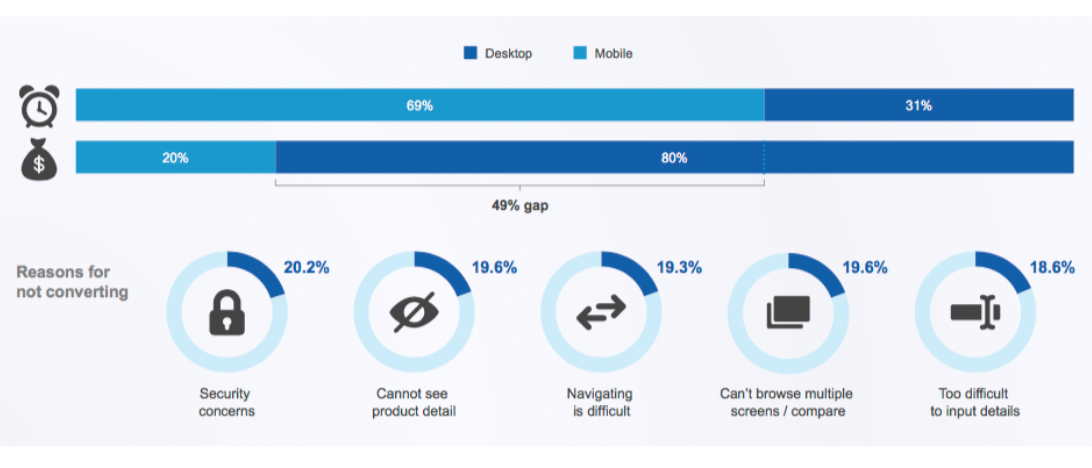
An interesting thing about mobile commerce is the large gap between time spent on mobile vs. money spent.
TechCrunch claims US consumers now spend 5 hours a day on their mobile devices. You read that right: five!
But now I’m compelled to introduce this data from comScore. It reveals a massive 49% gap between share of minutes on mobile versus share of ecommerce spend.
 Case in point: Exxel Outdoors operates ten ecommerce sites in the sports and outdoors business. In 2015, they realized their mobile traffic continued to increase, but their revenue didn’t follow.
In an effort to address the problem, they migrated all ten sites to the BigCommerce platform. The company reports it’s realized a 272% increase in mobile conversion rate and a 193% increase in mobile revenue YoY.
“The whole product discovery process is much better than it used to be and the checkout is much easier on BigCommerce,” claims digital marketing manager Cory Barnes.
Is payment the problem?
Ecommerce brands are quickly realizing optimizing the shopping experience for the mobile shopper is a “make-or-break” imperative. As I’ve written and spoken about in the past, success depends on creating a comfort zone for customers.
One of the top factors that minimize conversion, according to comScore, is the degree of difficulty inputting details on a smartphone, which obviously includes payment information.
The solution is seamless integrations with mobile wallets. Check out the amazing results reported here by ecommerce brand NatoMounts, which now enjoys a 5% mobile conversion rate and $20MM in sales over the past six years.
“By building these integrations with companies like PayPal and Amazon, BigCommerce provides non-household brands, like me, instant credibility,” says NatoMounts founder Brandon Chatham. “This equals a clear path to ~5% conversion rates on mobile with over 80% of sales on mobile.”
He added that integrations with one-click payment systems and an optimized single-page checkout increases order volume and makes the checkout process take less a minute.
14 tips for delivering mobile-friendly ecommerce
The problem is easy to understand. Smartphones create friction for mobile users and chase potential buyers away.
The solution’s easy to understand too but difficult to resolve. Essentially, as an ecommerce brand, you need to create the app-like experience customers now expect.
I’ve done some research and created a cheat sheet of tips to help you convert phone fanatics into customers.
1. Create a clean and categorical homepage
Newbies will scan your homepage quickly, If it’s full of promotional content, they’ll leave. Help them understand your offerings in an instant and if you offer multiple categories make that clear with an app-like pattern of buttons.
2. Create irresistible forms
Every form field increases the level of friction. Assume no one wants to see more forms or fields. Present copy to explain the benefit of completing the form. Explain why (and if) you need specific information. Automatically populate the billing address field to match the shipping address.
Make buttons easy to find and attractive. Consider the placement, color, size and other design elements. Ensure buttons are wide so shoppers can easily click on them without having to change their hand position
4. Emphasize free shipping
Just do it.
5. Demonstrate security
Security concerns loom large. (Check out the somScore research above.) Don’t allow mobile buyers to suspect their transactions will be intercepted by bad guys. Emphasize your page is secure with the software you use to secure it and SSL certification icon (lock).
6. Auto-detect credit cards
You can ask shoppers to select the credit card they want to use, but why? Simply setup your payment process to detect it automatically.
7. Simplify
Clutter will backfire. I know, you want to introduce nav bars, drop-downs, carousels, accordians, and what have you. Don’t. Instead, amplify the focus on search and autosuggest results.
8. Streamline checkout
When a customer is about to make a purchase keep them focused on doing so. No nav bars. In fact, everything that isn’t a part of the checkout process is a no-no.
9. Offer quick-pay options
Quick-pay services such as Apple Pay and Android Pay makes buying products fast and friction-free. Provide “buy now]”or “add to cart” buttons on the product page and introduce a device-related checkout methods when possible.
10. Show progress stops
Remember, we’re talking about phones. Consider all the distractions, especially social media updates. Help move your buyer along by communicating where she is in the process. Numbering the process or showing progress bars may be helpful.
11. Make guests welcome
You probably want your new customers to create an account, but insisting on it will decrease your sales. Let it go and instead encourage account creation after the purchase is complete.
12. Show passwords
Yeah, duh, passwords are a part of the process. Allows shoppers to see their password as they input it. The “dot, dot, dot” thing may look more secure, but is bound to backfire when the thumbs fly around.
13. Address the address thing
Entering shipping and billing addresses is a high-friction experiences in m-commerce. Address lookup of the autocomplete variety drastically improves accuracy and makes shoppers happier.
14. Provide instant error alerts
You know the routine: you get alerted you did something wrong after you tried to checkout. Shoppers hate that. If they make errors, let them know instantly.
Create a friendlier mobile store
In 2018, it’s still not uncommon to encounter an eCommerce business that hasn’t fully optimized for mobile. Now that mobile traffic has surpassed desktop, that’s a mistake you can’t afford to make.
Around 75% of smartphone users abandon sites that aren’t optimized for mobile. Put the tips I’ve offered here to work and capture more mobile sales.


![Website Navigation Matters [Content Matters Episode 21] Website Navigation Matters [Content Matters Episode 21]](https://feldmancreative.com/wp-content/uploads/2017/01/Episode-21.jpg)
Comments
How Ecommerce Brands Maximize Mobile Sales | ye...
[…] There's a large gap between time spent on mobile vs. money spent. This post offers 14 tips to maximize mobile sales for your ecommerce brand. […]