“Landing page” and “homepage” don’t mean the same thing.
Though many visitors to your website are bound to first land on your homepage, in the marketer’s lexicon, the two terms are not synonymous. They have different objectives.
I’ll begin with a fundamental idea that sets them apart.
- The primary objective of a homepage is to inspire the visitor to go to another page—a page that satisfies their informational needs.
- The primary objective of the landing page is to be the page that satisfies their informational needs.
It helps to think of a landing page as a “response page.” While a homepage can be deemed successful in a number of ways, and perhaps, also, in varying degrees, the landing page gets a simple pass or fail grade. It passes by achieving a conversion and fails otherwise.
But not so fast. Unbounce, a leading authority on landing pages, claims landing pages come in two varieties:
- Click-through landing pages aim to get visitors to click through to another page. This type of page is commonly used in ecommerce models because visitors are unlikely to buy when first landing on a checkout page. The page is likely to offer product details in hopes that it will inspire the visitor to click and buy.
- Lead generation landing pages are used to capture leads via a form. They typically describe an offer and call for visitors to submit an email address, and possibly more data, to complete a non-financial transaction. Note that the term “squeeze page” is also used to describe this type of page.
A landing page is usually linked (or the destination of) a traffic-building device of some sort from an outside source. Pay-per-click ads, social posts and ads, or emails are common examples.
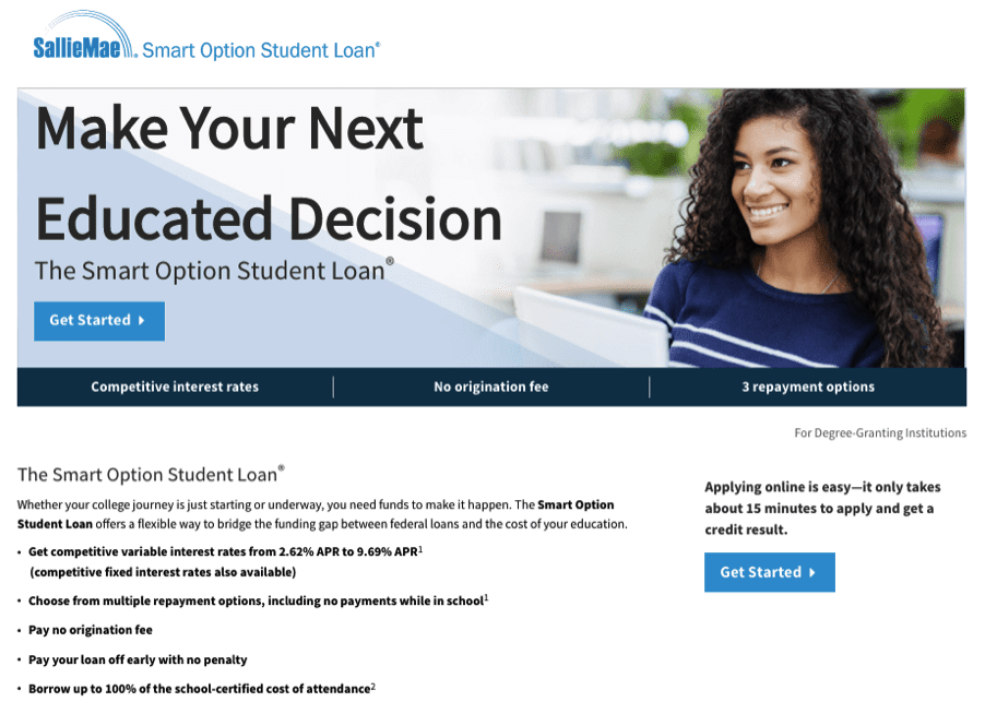
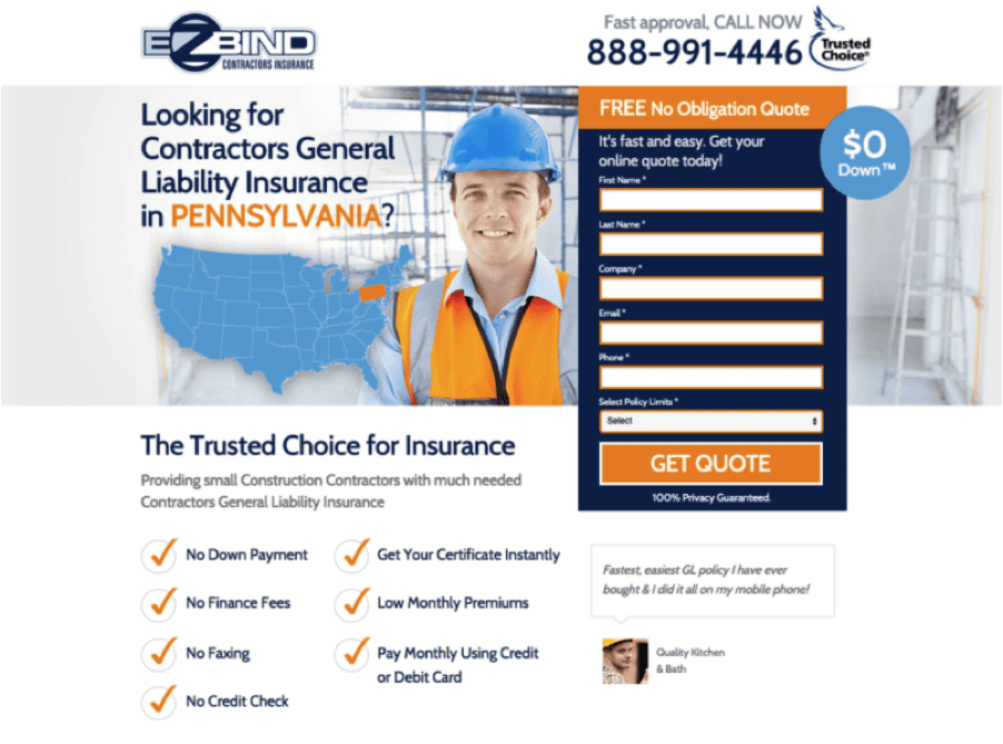
Above is an example of a click-through landing page. No form appears. Below is and example of a classic lead generation landing page.
Landing pages are simple
The key to landing page success is simplicity. Clutter the page and you risk cluttering the minds of visitors, which is bound to lower conversion rates.
Landing pages, therefore, should be simple to create. The suggestions that follow should help. Where it makes sense, I’ll point out how each tip might differ for a homepage.
Let’s begin with what not to put on your landing page: website navigation. You don’t want readers to navigate. Navigate essentially means leave. You want them to click only one thing: the button presented.
The navigation on your homepage is all-important and demands careful consideration. Here are seven solid tips to help you make smart choices for your website navigation.
2. The instant connection
Another thing a landing page shouldn’t have is an overly clever or oblique headline. Make it dummy proof.
The headline of your landing page should provide a crystal clear connection to the language used in whatever the reader just saw—and clicked. I call this the “keyword connection.” You don’t want to disorient visitors or force any unnecessary mental gyrations.
Write an unfussy headline that assures the visitor she’s arrived at the right page to fulfill her needs.
Here’s a stellar example of making a keyword connection and keeping it simple. Campaign Monitor’s PPC ad and landing both feature the words “Better Email Marketing.”

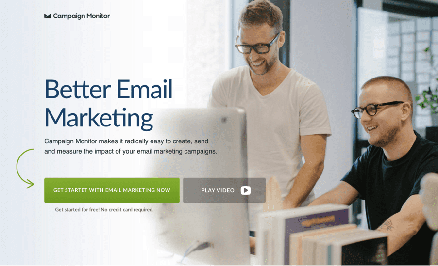
A homepage headline should also assure the visitor has arrived at right place—if they actually are a fit. Generally, landing page headlines focus on an offer, while home page headlines should focus on positioning the company and clearly communicating its value proposition.
3. The subhead segue
While it’s optional, it’s often useful to follow your laser-focused headline with a subheading. The line you write should serve as a segue from the headline to the copy that follows. This an ideal place to introduce or reiterate the value of taking advantage of the offer.
This same concept is useful for a homepage, however, the idea expressed should focus on the user’s need at a broader level.
4. Show me something
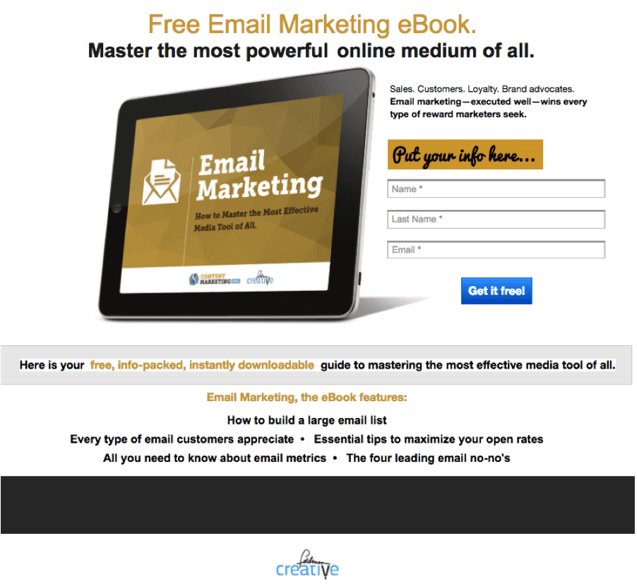
Most landing pages feature at least one image. Don’t overthink it. Like the headline, the image should help confirm the page’s reason for being—the offer.
If your offer is an information asset, such as an eBook, report, or webinar, display it in a pseudo physical form (booklet, computer screen, etc.). If the offer relates to a product, show the product.
Some offers might be more abstract, which is often the case with services, consultations, and such. If so, consider a friendly image of a person or group of people featuring visual cues to help make it relevant.
For many sales processes, adding a video to the landing page can be helpful. For instance, when I created a landing page to sell an online course on copywriting, a consultant advised me to introduce myself and the course with a brief video because it would help prospective students get comfortable with the teacher.
Using an image (or video) on a landing page isn’t a rule, but can make the page more attractive to visitors and impact conversion rates.
Landing pages on my website convert at a high rate because they prominently display what’s being offered. Visitors to this page will immediately understand what they get after completing the form.
Your homepage is also likely to feature a main image or hero shot and additional images to support the information presented.
5. Value-based copy
Your landing page needs to get to the point. In other words, what’s the value of your offer?
Like most effective sales copy, you can present a problem-solution sequence, but do so quickly. Effective copy for landing pages often presents the benefits of complying in a brief list.
Another option is to write and design content blocks giving each benefit its own piece of screen real estate. You’ll often see these presented in a grid where each element features a simple image (such as an icon) followed by a subheader and brief passage of copy.
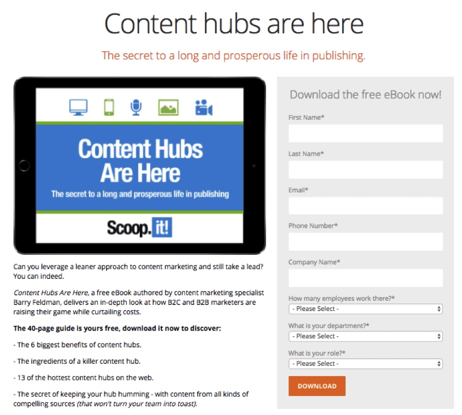
The landing page below quickly explains the value of the eBook being offered and includes a detailed list describing the content featured in the eBook.
Homepage copy is easily “chapterized.” You can make a point here, another point there, and present lists wherever appropriate. Don’t do this on your landing page. Think singularly.
6. Social proof
Author Robert Cialdini famously defines social proof as “the tendency to see an action as more appropriate when others are doing it.” He claims social proof is more powerful when we’re uncertain what to do.
Put yourself in the mind of your landing page visitor. He’s thinking, “Should I read, watch, listen to, try or buy this?” “Is it worth my time and money?”
Who would know? Those that have gone before you. Therefore, to elevate the persuasion powers of your landing pages, put social proof elements to work on it. Consider tactics such as:
- Testimonials
- Reviews
- Social media posts about the product
- Customer logos
- Media mentions (“As seen on”)
- Verification or trust seals
- Numbers, e.g. downloads, satisfied customers, shares, etc.
Orbit Media delves into applying the power of social proof on your website in Neuromarketing Web Design: 15 Ways to Connect With Visitors’ Brains.
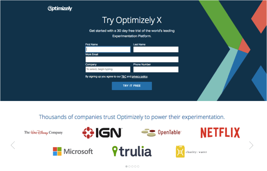
On this landing page below, Optimizely delivers social proof in the form of client logos and claims thousands of companies trust their product.
7. Simple form
Unless you’re creating a click-through landing page, your page will need a form and results will be measured by the percentage of visitors that complete and submit it.
You have options regarding the number of, and types of, fields to include. Consider the following:
- Shorter forms (such as email address only) will result in more leads, but often, less qualified leads.
- Longer forms will reduce the number of leads, but can help qualify them.
- As a best practice, ask for the only information you need from your leads to follow-up effectively.
- Avoid open-ended questions or difficult requests. For qualification questions, you might offer choices such as pull-downs (e.g. company size).
- Some marketing automation platforms will enable you to use smart forms that adjust according to the visitor’s behavior from past visits to the website.
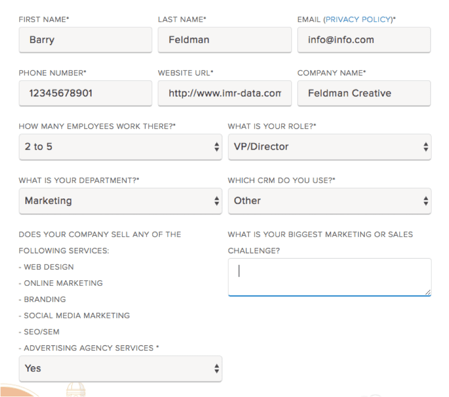
This form, from a landing page on the HubSpot site, is far from simple. HubSpot cleverly uses its own platform to present smart forms to return visitors. The fields are automatically populated with known user data, but request additional information to help qualify prospects.
A variety of tactics now offer options for presenting forms to visitors as preview pages, popups, slide-ins, overlays, and light boxes. You decide when and how they are automatically invoked (on arrival, scroll, time-based, or upon exit). You’ll have to draw conclusions regarding the risk/reward factor by experimenting.
Using forms on your homepage comes with the risk of annoying visitors. That said, you have a variety of options that may not detract from the user experience including placing simple forms in a sidebar, row or footer. The most common example would be to capture email subscribers.
Buttons might be the unsung heroes of highly effective landing pages. Your button should combine design and copywriting best practices to make it easy for the visitor to act on your offer.
High converting button copy is clear, specific, and often written in first person. For example: “Count me in for the free video course!” Here are tips for creating magnetic CTA buttons:
- Use action words that suggest value. Use words such as “get,” “reserve,” and “take” instead of “submit,” “click here,” and predictably generic commands
- Create contrast. Don’t go for pretty. Make your buttons standout with contrasting colors that can’t be missed.
- Try different shapes and sizes. Experiment with designs. Winners are likely to be somewhat large, but you may find overly heavy-handed designs work against you.
- Try different lengths too. Long and specific commands may outperform 2 or 3 word phrases.
- Urgency works. Tactics suggesting limited time offers, deadlines or even just the inclusion of words like “now” or “today” tend to convert.
- If your offer is free, say so. For obvious reasons, “FREE” always pulls well.
- Use directional cues. Arrows or graphics leading the eye to your CTA button can increase click-through.
I could go on about this important topic—and I have. Check out this thorough study of techniques to improve your call to action buttons (and the infographic below).
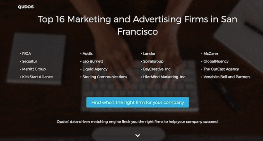
I applaud Qudos for making their call-to-action button highly descriptive, value-based and easy to find.
9. Guarantee
Writing a guarantee on your landing page is all about giving your visitors a parachute. It’s a way to tell your audience:
“Hey! There’s no big risk here! Go ahead and click that button! You’ve got nothing to worry about! It’s going to be awesome if you take me up on this offer, and if you don’t think it is awesome, I’ll make sure you’re no worse for wear!” (Source: Your Guide to Creating Landing Pages, by Leadpages.)
A guarantee doesn’t have to mean offering buyers their money back. You might also consider a guaranteed to resolve any issues. Even informing visitors their credit card information is 100% secure, or that you won’t spam them, can be considered a guarantee.
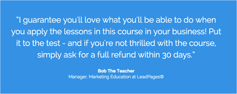
On a landing page for a course offered by Leadpages, the instructor offers a satisfaction guarantee.
10. Testing
You can optimize conversion by running A/B tests on your landing pages. With A/B testing, or split testing, you simply compare a control page (“A”) against a variation (“B”) that includes a major difference of some sort. After a period of time, or number of visits, you review the results and pull the plug on the lower-performer. You proceed by offering the winner or you can conduct additional tests aiming to make further improvements.
The landing page experts at Unbounce offer more insights on the process and recommend using it to test elements such as:
- Headline
- On-page copy
- Call-to-action copy
- Images vs. video
- Form length and style
You might also consider testing:
- Your offer
- Button design
- Page design
- Social proof
- Anything featured in this post
11. Thank you page
When a lead generation landing page succeeds, you may or may not have made a sale, but at the very least, you’ve captured a new email address—an interested prospect. Next, your customer or prospect should be thanked.
While many digital marketers send thank you messages via email, serving the new subscriber an immediate thank you page may be the better way to go (or you can do both).
- The thank you page confirms a conversion in your analytics.
- The thank you page can also kickoff important lead nurture or upsell processes.
Effective components of a thank you page can include:
- Instant access to your offer
- Social media sharing links
- Additional offers and calls to action
- Promotions
Andy offers great insights into the many ways to best capitalize on thank you pages here, and points out the different tactics for ecommerce, lead generation and newsletter signup thank pages here.
Go forth and convert
Though exceptions exist for certain types of online marketers, homepages generally are not designed to convert. Landing pages are. A specialized type of landing pages (mostly for ecommerce) aims to produce click-throughs, but most should be optimized to capture data or dollars.
There are meaty amount of tactics you can try to improve landing pages. This post offers a meal full of them. Try them out. If you have insights for landing page conversion, please share them in the comment section below.
Note:
I originally wrote a version of this post for Orbit Media, where I am a regular contributor.



Comments
Camilla Hallstrom
What you say about instant connection is SO true — too often, there’s a disconnect between the ad vs the landing page and/or the headline is clever and creative because businesses underestimate customers’ time & energy restrictions. Thanks for these tips!
Erika Parker
The article is definitely useful, thanks! It`s crucial not to confuse landing page with home page. Home page has too many options and looking through all of them to find the particular product can distract a visitor from making the decision. So landing page is in most cases much more efficient than home page.
My company struggles with a landing page, so I have to read many and many articles about it. And surprisingly I find ever-greater details almost every time. Your article is not an exception.
The reason why we need to pay such attention to landing pages is the functions they carry out.
Effective landing pages are designed to capture leads that enable you to market to people in the future, or to “warm up” potential customers to the product you are trying to sell to them before sending them further into your sales funnel. That`s important to keep in mind while creating a landing page.
As I have already mentioned, my team has gotten acquainted with a landing page theme. So we wrote an experience-based article, where we gave some advice on how to create an effective landing page. Read it to know how not to ruin your business with a single web page https://kraftblick.com/blog/saas-landing-page/
Anubhav Bhattacharyya
Hi Barry,
The point you make about Guarantees is really important. People tend to skip it completely.
I think it is vital to position the Guarantee close to the CTA. This proximity will help the potential customer receive a final bit of assurance, and be ready to convert.
Ramit Sethi does a wonderful job with his guarantee for a course when he says – “Try the entire course. If you don’t LOVE it, I insist that you get 100% of your money back. I’ll even eat the credit-card processing fees.”
Brian Dean mentions his guarantee in this manner – “I’ve also got a 30-day No-Questions-Asked money back guarantee”, the phrase no-questions-asked making it even more compelling for interested visitors.
Although it isn’t necessary to give an explicit guarantee, HelpScout does an amazing job by providing a level of comfort that’s similar to a guarantee. They use relevant award and shield icons with their “World Class Training” and “Privacy & Security” features which are also reminiscent of trust badges, further enhancing this assurance.
You can read more about Guarantees and essential Landing Page elements here.