Building your personal brand? You need a website.
Here’s your guide to making it great.
Your personal brand website is your home on the web, the hub of the content you create and a destination for every member of the network you’re building to power your career.
“But wait,” you might say, “I have a LinkedIn page. I have all kinds of stuff going on in social media channels. Do I really need a website too?” You do.
The content you post on social media networks belongs to those networks. You need to own your personal brand and purposefully direct it. You do that first and foremost with your website, which allows you to:
- Project yourself the way you want, the way you control
- Stand out from those you compete with
- Globalize your reach
- Create connections with like-minded people
- Create a calling card that’s far more compelling than a business card or resume
This post (based on a chapter from my book The Road to Recognition, the A to Z Guide to Personal Branding) will explain how to create a website for your personal brand that’s credible, visible, scalable, and user-friendly. It’s a fun and easily manageable project if you take it one step at a time.
(I’m happy to offer you a free electronic copy of The Road to Recognition. Just contact me to request one.)
Stick around for the “show and tell” portion of the post at the end [or JUMP to it now] because I also want to show you many fine examples of personal branding websites and highlight what I believe are useful, well-executed features.
Establish your domain
Creating a website calls for a number of technical considerations, including securing your domain name, contracting with a web hosting service provider, and selecting a platform that will serve your needs.
- Domain name—Your domain name is your address on the web. Investigate your options at a domain name registrar service. If you can’t secure a .com (your name.com), buy the rights to use .net, .me, or another suffix that suits you.
- Web hosting—Select a company to serve as your website host and then a specific package from their service offerings. You can be frugal when you make the choice and upgrade to a higher performance package in the future when the need arises.
- Website platforms—Content management systems (CMS) give you control of your website design, functionality, and performance. Functionality varies from platform to platform, but all CMSs give you the ability to edit and update your website quickly. WordPress is the most popular CMS platform by far, used on over 15 million websites across the web. Because WordPress is so popular, it’s easy to find designs, plugins, developers, and services to help you create the website you want.
Website builders such as Squarespace, Wix, and Weebly allow you to create websites using a template and drag-and-drop interface. Website builders are inexpensive and spare you from dealing with coding, software maintenance, or other technical aspects. However, website builders may be too limited to fulfill your needs as they expand.
That’ll be all—here and now—for the techie parts of building your personal brand website. However, if you want to be stepped through the process, here’s a great guide:
Make a plan
You can make the process smoother and faster with:
- A website map—A smart starting point for structuring your website is to create a site map. You can do so with a simple list of pages, a spreadsheet, or basic flow chart.
- Wireframes—Wireframing is a popular technique to plan navigation, page layout, and the basic structure of web pages before the actual design work begins. A wireframe is usually done in black and white so the focus is strictly on mapping the page and placing individual elements. Wireframes can be sketched on paper, created with PowerPoint or Keynote, or with online wireframing tools.Note: if you’re to work from website theme template (free or purchased), this step may be unnecessary.
- A creative brief—A creative brief document helps take your project from concept to completion. It should articulate a set of objectives and summarize the factors that will impact the website’s development, such as: objectives, audience, competitors, tone, message, visuals, design preferences, budget, and any other details to help the team get on the same page.
A smart start strategy
You can indeed learn all the tricks of the trade and if you’re on a tight budget, you may have to. However, you may also want to consider working with an expert or two. Though many platforms make it easy to get started on your website, getting the return on investment you want will likely require bringing in some experts. A complete website production team covers:
- Copywriting
- Graphic design
- Development
- Search engine optimization
- Conversion
Tackle the roles you feel comfortable with and hire experts to help with the rest. When working with your team, especially with designers and developers, I propose a “smart start” strategy, which simply calls for referencing designs you like. Go web surfing in search of websites that feature design ideas and elements that turn you on.
Makes notes regarding the elements you feel are a fit for your website and share them with your team. Mix, match, and make these strategies work to serve your purposes.
Put the pieces in place
Here are many common website elements, which you might want to include.
- Header—The header of your website should be elegant and uncluttered, with the logo in the upper left corner. Place the menu in the same position all across your site and ensure it looks and operates consistently.
- Hero shot—Your hero shot is the main image on your home page and, along with its headline, should inspire the right visitors to interact further. Avoid corny stock photos. For a personal branding site, a professional photo of you is appropriate.
- Calls to action—Each page should have an objective and strive to achieve it with a call to action. Provide simple, clear directions and make sure they’re easy to see and easy to follow.
- Forms—To collect visitor information, subscription forms and other forms may appear on landing pages, a “contact us” page, in the main body of any page, or in a sidebar or footer. To increase conversion, request only the information you need and no more.
- Trust builders—Elements you can feature on your web pages to foster trust include:
- Testimonials
- Accolades and awards
- Certifications
- Memberships
- Security symbols
- Various types of “earned” badges
- Ratings and reviews
- Policy statements
- Guarantees
- Internal site search—Offer your visitors a mechanism to search for content on your site.
- Share buttons—Add social sharing buttons (often presented in bars) to make it easy for visitors to share your content via their social network accounts.
- Follow buttons—Use social media follow buttons to make it easy to connect on your social pages.
- Web forms—Place a form on your contact page and other places on your site where it makes sense.
- Footer—It’s useful to place important information and quick-access links in your website’s footer.
- Additional elements—Depending on what you do, you may want to include:
- Membership access
- A portfolio
- Links to your blog, content hub, and resources
- Features and benefits of your product and/or service
Build an email list
I like to say, “You don’t just want people to visit your site; you want them to subscribe to it.” If you agree, you’ll want to build an email list and use it to let subscribers know when you have new content for them.
A highly effective strategy for building an email list is to offer a lead magnet. Simply said, you offer access to something of value in exchange for the visitor’s email address.
Following are some effective and popular free offers you can develop for your personal brand website:
- E-book
- Cheat sheet or checklist
- Template
- Video (or video series)
- Audio (or audio series — see Marie Forleo and Michael Hyatt examples below)
- Webinar
- Tool kit or resource list
- Assessment
- Free consultation
Website design considerations
Steve Jobs famously said, “Design is not just what it looks like and feels like. Design is how it works.” Your goal is to balance intuitive navigation with engaging design to help visitors quickly find what they seek and deliver a positive customer experience.
- Eliminate clutter and remove anything that isn’t necessary.
- Organize content logically, in buckets, so to speak.
- Avoid features such as complex animations, auto-play videos, and music.
- Plan your page top-down, where messages are presented in order of importance.
- Select colors and images that work well in a cohesive design.
- Budget white space (or negative space) between graphics, columns, images, text, margins, and other elements. The use of white space creates a feeling of comfort and elegance and guides the eye to important elements.
- Avoid reader fatigue with sizable text, narrow line lengths, and ample leading (the space between lines of copy).
- Make most page layouts uniform across your site to maintain a clean, organized feeling.
Tips for writing your most important pages
Here’s a quick set of writing pointers for your most important pages, the pages that have become standards for the majority of websites.
Homepage—Write the homepage copy to function as the lobby of your website. Its main purpose is to direct readers a level deeper into your site—to engage them. Think along the line of, “Hi, stick around and click around.”
- Write a big, bold headline that conveys a sense of belonging. The ideal headline should qualify the reader by saying, “You’re in the right place if…”
- A clear and concise introduction should follow. Don’t get self-serving and boring. Remain focused on the readers’ desires.
- Use, but don’t overuse, keywords, key phrases, and derivatives of them. Be deliberate for the search engines but natural for the reader.
Here’s an infographic that provides a list of ideas for your homepage:
About page—Your About page is sure to be one of the most visited pages on your website. Don’t make it a snoozer.
- Be interesting. You want the reader to want to know more about you, not less. Make every line interesting and support your value proposition.
- Write in a friendly tone, avoiding stiff and boring mission and vision statements that reek of press releases.
- Don’t inflate your story. Be wary of superlatives and hyperbole. Establish credibility by being honest.
- Have some fun here. This is your website. Infuse it with your personality. Try video. Quotes. Fun images. Make your About page a page that could only reside on your website.
Get more copywriting tips for your about page.
Landing pages—The following tips speak to pages created to solicit an opt-in or a desired action from a visitor. A landing page is not about helping people find what they want; it’s about delivering it.
Make a deliberate keyword connection. Visitors came by way of a search query, a social media post, an ad, or an email. It’s important that they feel they’ve landing on the right page after clicking through. Connect the dots by clearly restating in your headline the keywords that drove them here.
- Focus solely on the offer. Stay on point and do not offer any links or elements that could potentially reduce conversion.
- Hammer home the value being offered with action words. Answer the questions, “why this” and “why now,” in no uncertain terms.
- Show your offer and describe it in a caption. In fact, it’s a good idea to make every section of your landing page have some stand-alone power that reiterates the promise.
- Make your form short and simple. The more information you require, the fewer opt-ins you’ll generate.
- Use social proof, especially testimonials.
- Make your buttons work. Avoid generic “asks.” Try short, directive value statements such as “Send me my free tips.”
Get more tips for improving conversion on your landing pages.
Contact pages—You don’t want to overlook the page prospects head to when they want to get in touch.
- As with a landing page, fewer fields equals more responses.
- Increase responses by increasing contact options. In addition to a form, consider offering email (and/or specific email addresses), phone, fax, text, chat, and even a mailing address.
- There’s no reason your contact page shouldn’t be a fun part of the website, reflect your brand, and add to the customer experience.
Optimize each page
When the pages of your personal branding website are optimized for search, you can generate more traffic, leads, and sales through your website. We’ll scratch the surface with some need-to-know basics here.
If you’re new to SEO, I want you to know it’s not as frightening or complex as you might imagine, nor is it difficult to understand the essential elements of optimizing your site for search.
The foundation of your SEO relies on effectively implementing basic optimization across your website. It begins with keyword research. Your challenge is to identify the words your target audience uses to search for content.
Be forewarned: with a new website, you won’t do well to select broad, highly competitive keywords. Instead, follow the tips below to select “long-tail” keywords with less competition.
Try brainstorming to get started. Evaluate the topics your website focuses on and create a list. Graduate next to expanding your list of keyword ideas with keyword discovery tools. (I’ve become a big fan of the great, and free, Keywords Everywhere extension). Check out the keywords your competitors use with SEMrush, Alexa by Amazon. or the free tool, Ubersuggest.
Finally, cull your keyword ideas into a shortlist of the most promising keywords and phrases for your website.
When you’re ready to place the keywords you’ve chosen on your pages, be careful not to overdo it. Search engines will penalize keyword-stuffed pages. Keep it simple by using one to five keyword phrases per page and optimize each with natural language.
How to optimize your pages
According to Moz, an ideally optimized web page is hyper-relevant to a specific topic. How do you achieve hyper-relevance? First and foremost, the page must provide unique and useful content on the subject. Additionally, the page must be “marked up” in its code so keywords are:
- Included in the title tag
- Included in the URL
- Used within the copy of the page
- Included in the alt text of the images on-page
Fear not. Coding skills are not necessary. When you get comfortable with your CMS, you’ll find marking up or “tagging” page elements is easily done within the editor.
Is that all there is to it?
On-page and off, there’s always more to search engine optimization than you (or anyone) could know. Search algorithms change relentlessly. They’re kept secret. And the powers that be will never totally reveal the secrets.
The best you can do is gather insights from experts who analyze SEO, experiment with the practices they propose, and control what you can.
For further on-site search optimization:
- Create internal links—Help search engines learn more about your website by internally linking to other pages within your content.
- Use header tags—Various levels of HTML header tags (H2 and H3, for example) help break your content into sections and tell search engines what each section is about.
- Deliver a speedy and reliable website—Slow-loading web pages and website uptime issues negatively affect rankings.
- Create a responsive site—Mobile-friendly websites are rewarded with higher rankings on mobile searches and labeled “mobile friendly.”
Now let’s look at some great examples of personal brand websites.
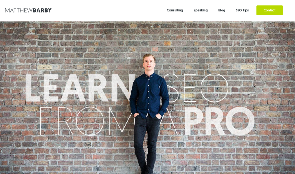
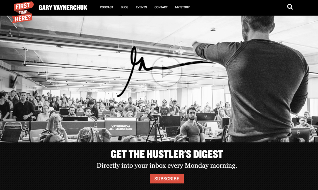
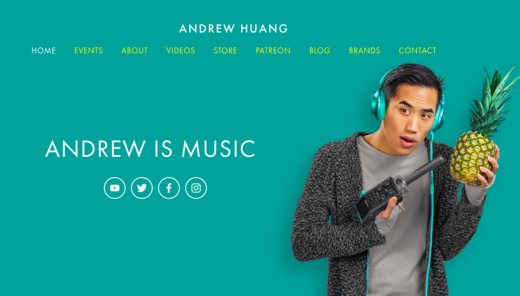


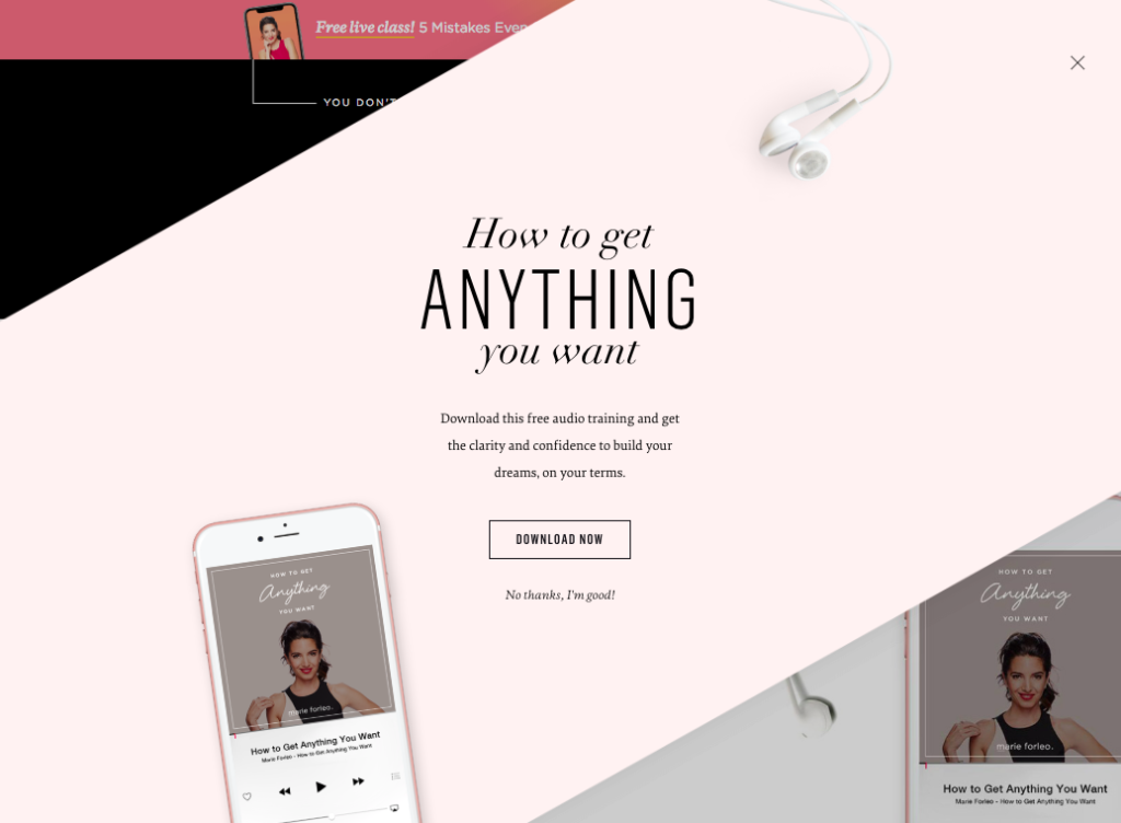


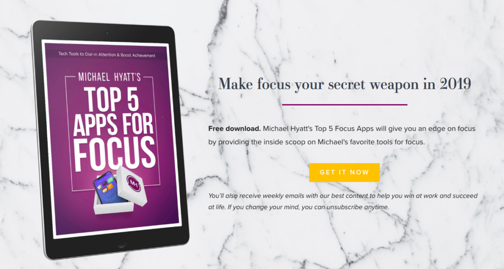

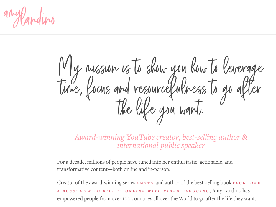
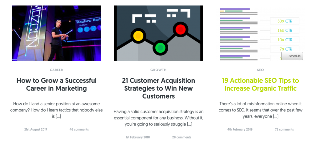


Do you have a great personal brand website? Share it with me and I’ll feature one of its highlights as well.
Want help with your personal brand? Check out the service I offer here.



![What Makes a Website Successful? [Infographic: 21 Tips for Creating a Great Website] What Makes a Website Successful? [Infographic: 21 Tips for Creating a Great Website]](https://feldmancreative.com/wp-content/uploads/2019/05/Creating-a-great-website.jpg)

Comments
Why and When you need a personal brand website - Digital Media & Technology Zone
[…] Source: feldmancreative.com […]